


A rebrand is never just a new logo. It’s asking millions of people to rewrite a relationship with your business that took years, sometimes decades, to build.
Get that wrong, and you’re not just replacing a design file; you’re erasing the exact visual shortcuts customers use to find and trust you on a crowded shelf or a crowded feed.
The four disasters in this blog aren’t included because their new logos looked bad.
Plenty of ugly logos survive just fine.
They’re here because each one broke a specific strategic rule, and each one cost real, measurable money finding that out.
In short: the worst rebrands in history failed because they treated a strategic or business problem as a design problem, erased the visual cues customers relied on to recognise the brand, and rolled out without testing against real market reaction, costing companies tens to hundreds of millions of dollars in lost sales, reversal costs and brand value.
Fast facts
| Rebrand | Year | What went wrong | Cost |
|---|---|---|---|
| Tropicana | 2009 | Removed the iconic orange-and-straw image | $30 to $35 million in lost sales over six weeks |
| Gap | 2010 | Replaced 20 years of branding with generic Helvetica | Estimated at up to $100 million, reversed in 6 days |
| Twitter to X | 2023 | Discarded a globally recognised bird logo and brand verbs | Brand value fell from $5.7 billion (2022) to $673.3 million (2024) |
| Royal Mail to Consignia | 2001 | Renamed a 350-year-old institution to a meaningless invented word | £1.5 million to launch, roughly £1 million to reverse 15 months later |
Table of Contents
- Why do rebrands go wrong more often than you’d think?
- Tropicana (2009): the £35 million lesson, or was it?
- Gap (2010): the six-day Helvetica disaster
- Twitter to X (2023): discarding universal brand recognition
- Royal Mail to Consignia (2001): the meaningless name shift
- RadioShack (2009): the rebrand that changed the name, not the problem
- Why rebrands fail: the 3 cardinal rules broken
- How to rebrand safely without burning customer trust
- In Conclusion
- FAQs
Why do rebrands go wrong more often than you’d think?
Rebrands go wrong most often when a company uses a cosmetic change, a new logo, name or colour palette, to try to fix a problem that’s actually strategic: declining sales, a confused positioning, or a business model that no longer fits the market.
This is the pattern behind every case study in this piece. None of these was simply examples of branding mistakes to avoid on a design level; they were businesses under real pressure reaching for the fastest visible change available, rather than a genuine Brand positioning strategy that addressed what was actually wrong.
A few things tend to be true of every rebrand disaster:
- The company was already facing a real business problem before the rebrand: declining footfall, falling stock price, or a positioning crisis
- The new identity was tested inside the boardroom or agency pitch room, not against real customers in a real market
- Distinctive brand assets, the exact colours, shapes or icons customers use to recognise a brand at a glance, were discarded rather than evolved
Understanding famous rebrand failures properly means looking past “the new logo was ugly” and asking what business problem the company was actually trying to solve with a paintbrush.
Tropicana (2009): the £35 million lesson, or was it?
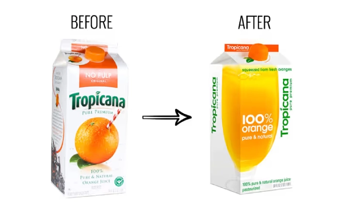
Tropicana’s 2009 packaging redesign replaced its iconic orange-with-a-straw image with a generic glass of juice, causing unit sales to drop roughly 20% within two months and costing an estimated $30 to $35 million in lost sales before the company reverted to the original design.
This remains one of the most cited Tropicana rebrand case study examples for a reason: the failure had nothing to do with taste and everything to do with recognition.
- Tropicana Pure Premium generated over $700 million a year in revenue on the strength of packaging shoppers could spot instantly from a distance
- The redesign, by agency Arnell Group, swapped that recognisable orange-and-straw image for a plain glass of juice and a generic cap shape
- Shoppers didn’t dislike the new look so much as they genuinely couldn’t find their usual product on the shelf; some assumed their store had switched to a private label
By 23 February 2009, just over six weeks after launch, Tropicana announced it was reverting to the original packaging. The strategic failure here wasn’t aesthetic; it was the loss of shelf recognition itself, the single job packaging is actually meant to do.
Gap (2010): the six-day Helvetica disaster
View this post on Instagram
Gap scrapped 20 years of its recognisable navy Blue Box logo for a generic Helvetica wordmark in October 2010, triggering such immediate and widespread backlash that the company reversed the decision within just six days, at an estimated cost of up to $100 million.
The speed of this reversal is what makes it one of the most studied Gap logo rebrand failure cases in branding history.
| What happened | Detail |
|---|---|
| Launch | 6 October 2010, no advance warning to customers |
| Backlash | Over 2,000 negative comments within 24 hours, roughly 14,000 parody logo submissions |
| Reversal | 12 October 2010, six days after launch |
| Estimated cost | Up to $100 million, though never officially disclosed by Gap |
Gap was genuinely facing declining store footfall and a stock price that had dropped sharply in the wake of the 2008 financial crisis. The rebrand tried to answer that problem with a new logo instead of addressing the product line or in-store experience that was actually driving customers away, a textbook case of confusing a positioning problem with a design problem.
Twitter to X (2023): discarding universal brand recognition
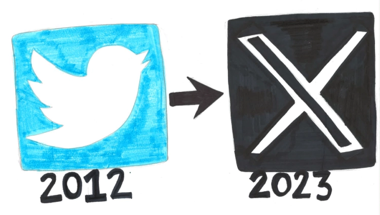
Elon Musk’s decision to rename Twitter to X in July 2023, discarding the bird logo and terms like “tweet,” was estimated by brand analysts at the time to have wiped out between $4 billion and $20 billion in brand value, with Brand Finance’s tracked valuation later showing the brand falling from $5.7 billion in 2022 to $673.3 million by 2024.
This is a more layered case than a simple design failure, which makes it a genuinely useful one to study.
- The rebrand erased not just a logo, but a set of verbs, “tweet” and “retweet,” that had become part of everyday language, a level of embedded recognition few brands ever achieve
- Immediate analyst estimates of lost brand value ranged widely, from $4 billion to $20 billion, reflecting how difficult brand valuation is in the moment
- Brand Finance’s own tracked figures show a clear multi-year decline, though this is attributed to a combination of the rebrand itself and separate business pressures, including falling advertising revenue and advertiser concerns over content moderation, not the name change in isolation
The lesson here isn’t purely about the logo. It’s that Twitter alienated existing users and advertising partners without clearly communicating what the new “X” identity actually offered them in return, discarding recognition without replacing it with a clear reason to stay, a coordination failure between brand and communication that any experienced Digital marketing agency would flag as a risk long before launch day.
Royal Mail to Consignia (2001): the meaningless name shift
View this post on Instagram
Royal Mail rebranded to “Consignia” in 2001 for £1.5 million, only to reverse the decision roughly 15 months later at a further cost of around £1 million, after the invented name was widely mocked and failed to convey that the company was even a postal service.
Few rebrands illustrate the risk of abandoning heritage for corporate jargon quite as clearly as this one.
- The name was developed over a two-year consultancy process, intended to reflect the group’s ambitions beyond mail into logistics and international expansion
- The public and media response was overwhelmingly negative, the name was seen as meaningless, and critics noted it didn’t even communicate that this was a 350-year-old British postal institution
- The Communication Workers Union publicly boycotted use of the name, a rare case of internal stakeholders actively rejecting a rebrand alongside the public
Roughly 15 months after launch, the company reverted to Royal Mail, having spent close to £2.5 million in total across the launch and reversal for a name change that left the business no better positioned than before it started.
RadioShack (2009): the rebrand that changed the name, not the problem
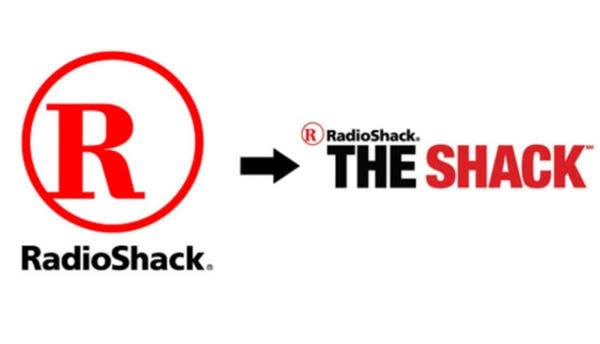
RadioShack’s 2009 push to market itself as “The Shack” was meant to modernise an ageing electronics brand, but the campaign became a cautionary example of what happens when a rebrand addresses perception without fixing the underlying business problem. The company did not officially abandon the RadioShack name, but it heavily promoted “The Shack” across advertising as part of an effort to appear more relevant to a mobile-first consumer.
This makes the RadioShack rebrand case study especially useful because the problem was not simply that the new nickname sounded awkward. The deeper issue was that consumers increasingly had fewer reasons to shop at RadioShack in the first place.
- RadioShack said customers and employees already referred to the retailer as “The Shack,” so the campaign attempted to turn that nickname into a fresher brand platform.
- The advertising shifted attention toward mobile phones, wireless products and connectivity, moving away from RadioShack’s historic association with electronics parts, cables and hobbyist products.
- Critics argued that the rebrand failed to create a meaningful new competitive position against big-box electronics retailers and rapidly growing online alternatives.
- RadioShack continued to struggle in the following years and eventually filed for Chapter 11 bankruptcy protection in 2015 after prolonged revenue declines and 11 consecutive quarterly losses. That collapse had much broader causes than branding alone.
The strategic mistake was treating dated perception as a naming problem when the real challenge was relevance.
Why rebrands fail: the 3 cardinal rules broken
The rebrands in this piece all broke the same three rules: they used design to solve a strategic problem, discarded distinctive brand assets instead of protecting them, and skipped genuine testing with real customers before a full rollout.
Rule 1: Never confuse a positioning problem with a design problem. A new logo will not fix poor customer service, an outdated product line, or a business model that no longer fits the market. Gap and Tropicana both reached for a visual fix for operational problems.
Rule 2: Respect distinct brand assets. Identify what customers actually use to recognise your brand, colours, shapes, mascots, specific icons- and protect them, even while modernising everything around them. This is precisely the discipline a specialised Visual identity design agency brings to a rebrand, distinguishing genuine modernisation from the wholesale erasure that sank Tropicana’s orange-and-straw and Gap’s Blue Box overnight.
Rule 3: Test with real customers, not just agency boardrooms. Internal focus groups and pitch-room approval suffer from an echo chamber effect. Every case study here was validated internally and rejected almost immediately once it reached the real market.
How to rebrand safely without burning customer trust
Rebranding safely means auditing existing brand assets before touching any design file, favouring evolutionary updates over radical overnight changes, and pairing any visual identity shift with clear, transparent communication to customers about why the change is happening.
A practical approach any brand can follow:
- Conduct a genuine brand asset audit first, identifying exactly which colours, shapes or symbols carry real recognition value before deciding what to keep
- Favour evolutionary updates over radical, overnight overhauls, changes customers can absorb gradually are far less likely to trigger the kind of backlash seen in these case studies
- Pair any visual identity change with clear, transparent communication explaining the “why” behind it, rather than letting customers discover the change cold
This is exactly the methodology a professional creative branding agency should bring to any rebrand conversation, treating the existing brand as an asset to be protected and evolved, not a blank page to be redesigned from scratch.
In Conclusion
Every rebrand disaster in this piece had access to talented designers, experienced agencies and, in most cases, genuinely reasonable strategic ambitions. What they lacked was discipline: the discipline to separate a design decision from a business decision, and the discipline to test a change against real customers before betting the brand’s equity on it.
The businesses that rebrand successfully aren’t the ones that avoid risk entirely; they’re the ones that protect what’s actually working while changing what isn’t, and that give customers a reason to come along for the change rather than rebel against it.
Planning a brand evolution without risking your hard-earned equity? Partner with our Digital Marketing Agency team to execute a data-driven visual refresh that honours your heritage while driving growth. Drop us a line at hello@florafountain.com and let’s map out a rebrand that customers actually recognise on the other side.
Frequently Asked Questions

Vasim Samadji is a partner at Flora Fountain, where he leads the Business and Marketing Strategy divisions. In a world where everyone is used to sugarcoating, his directness is often considered rude. But that shouldn't be a problem if you like the no-nonsense approach. Because he is a seasoned professional...