75% of people judge if the company is credible or not based on its website design. That’s a huge number of people! As a result, having a well-designed, functional and user-friendly website can be the difference between gaining a new customer and losing them to a competitor.
So how do you build a website that’s not just pretty but “good”? Does a good website mean a flashy design and modern layouts? Or is it more about functionality, speed and usability?
Well, the truth is, it’s a combination of many factors. And in this blog, we will tell the most fundamental pieces of advice on creating a good website.
Table of contents
- Design for User Experience (UX)
- Create Visually Stunning Website
- Keep Website Content Relevant for Users
- Work on the Site’s Performance and Speed
- Design for Everyone
- Test and Improve
- Stay Updated with the Latest Trends
- In Conclusion
- Frequently Asked Questions
1. Design for User Experience (UX)
When we talk about UX, we’re essentially talking about how a person feels when interacting with your site. A good website offers a positive experience that keeps users engaged and makes their journey easy and enjoyable. So, how do you create this?
Keep the Design As Simple As Possible
The most fundamental rule for good web design is to keep things simple and clear. Users should never have to guess what to do next. A complex design or cluttered layout can overwhelm them, leading to high bounce rates. Instead, create a clean, intuitive design with a clear purpose on every page.
Make Sure Your Website Has Fast Load Time
According to a Forbes article, 47% of users won’t wait if a website doesn’t load in 2 seconds or less. That’s why speed matters.
A slow website not only frustrates users but also hurts your rankings on search engines. Optimise images, minimise HTTP requests and make sure your site is coded efficiently to improve load times.
Ask your peers working at a web development company to build a speedy and functional website.
Mobile-Friendly Website Is a Must
60% of global web traffic comes from mobile devices. If your website doesn’t work properly on mobiles— users will just leave and visit a competitor website instead.
So, your website must be mobile-friendly. Make it responsive for both mobile and desktop devices.
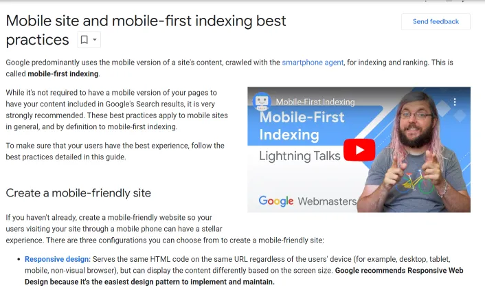
Additionally, refer to Google’s guidelines for mobile-first indexing. This will ensure that users can easily find you in the top search results whenever they searching for something related.

Ensure Easy Navigation
Make sure your navigation is consistent across all pages. Users should know where to go without having to think too much.
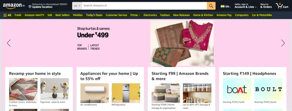
Use a familiar structure like a top bar or sidebar menu and label your pages clearly. Don’t try to get too creative with navigation. Rather, work on making is simple and clear.
Try to embed mobile breadcrumbs if required. Breadcrumbs are a secondary navigation system that shows users where they are on your site.
It can improve user experience, especially for complex sites with many layers of pages. They give users a quick way to jump back to higher-level pages without having to rely on the “back” button.

And make good use of internal links to guide users from one section to another. Not only does this help with navigation, but it also boosts your SEO by helping search engines understand the structure of your site. The easier it is to navigate, the more time users will spend exploring.
2. Create a Visually Stunning Website
The way your website looks is the first thing users notice and it can influence their decision to stay or leave. While the UX is the backbone, your website’s visual design is what gets people through the door.
Your website should reflect your brand’s identity. Use an identical colour scheme so that people recognise your brand.
Stick to 2-3 primary colours that match your brand and use complementary colours to create a cohesive look.
Typography is equally important in the visual design of the website. The fonts you choose can make or break your site’s readability. Use easy-to-read fonts that are consistent with your brand’s voice.
Avoid using too many different font styles as it can make your site look chaotic. A general rule of thumb is to use no more than two or three fonts throughout the site.
Also, be careful with the whitespace. It is the empty area between elements on a page. It might seem like wasted space but it’s essential for good design.
Whitespace helps to declutter your pages, making them easier to navigate and more visually appealing. It also helps direct the user’s attention to key elements on the page.
3. Keep Website Content Relevant for Users
Your website can have the best design in the world, but if the content is lacking, users will leave. Content is what keeps visitors engaged after the design catches their eye.
Follow these guidelines for keeping content relevant.
a) Write for Your Audience
Know your audience and create content that speaks directly to them. If you’re designing for B2B professionals, focus on the pain points they encounter and provide solutions.
Avoid fluff and filler content—every word should add value to your readers’ experience.
b) SEO-Optimised Content
Great content is not just about readability, it also needs to be optimised for search engines. Conduct keyword research to find terms your target audience is searching for. Use those keywords naturally in your content, but don’t overstuff them. Meta descriptions, headers and alt text for images should all be optimised to improve your SEO ranking.
Take help from professionals at SEO company to ensure that your site is optimised for search engine.
c) Engaging Formats
While written content is important, don’t overlook other formats like videos, infographics and interactive elements. People learn in different ways and offering a variety of content formats can keep your audience engaged for longer periods.
4. Work on the Site’s Performance and Speed
Speed is a key factor in a website’s success. A slow website can frustrate users and drive them away. You only have a few seconds to grab a visitor’s attention, so your site must load quickly.
1. Optimise Your Images
Large image files are one of the biggest culprits of slow load times. Compress images to reduce their size without sacrificing quality. Tools like TinyPNG or JPEGoptim can help with this.
2. Minimise HTTP Requests
Every element on your website—images, scripts, stylesheets—requires an HTTP request. The more requests your site has to make, the slower it will load. Combine files where possible and reduce the number of elements on each page.
3. Utilise Caching
Caching allows a web page to be stored in a user’s browser, so when they revisit the site, it loads faster. Implement browser caching for elements that don’t change often, like logos and stylesheets, to enhance performance.
5. Design for Everyone
An often overlooked but vital element of a good website is accessibility. Ensuring that your site can be used by people of all abilities isn’t just good practice—it’s essential.
a) Use Alt Text for Images
Alt text is a description of an image that is used by screen readers to help visually impaired users understand the content. Make sure every image on your site has descriptive, concise alt text that accurately reflects the image’s purpose.
b) Contrast and Readability
Ensure there is sufficient contrast between the text and background to improve readability, especially for users with visual impairments.
6. Test and Improve
A great website is never truly “finished.” The best websites are continually tested, analysed and improved over time. There’s always room for refinement, especially as user preferences and industry trends evolve.
Hence, conduct regular UX audits. A UX audit helps you evaluate the effectiveness of your website’s design and functionality.
Review your site from a user’s perspective. This will help you identify areas for improvement—whether it’s navigation, readability or overall user flow. Do this periodically to keep your website fresh and relevant.
Then, test your website by opening it on different devices such as phones or tablets or laptops.
Your website may look perfect on a desktop but what if it doesn’t look good on a smartphone or tablet?
Regularly testing your site across different devices and browsers ensures a consistent user experience for all visitors.
7. Stay Updated with the Latest Trends
Web design is an ever-evolving field. To maintain a good website, it’s crucial to stay updated on the latest trends and technologies. This doesn’t mean you have to jump on every new trend. But being aware of what’s current can help you make informed decisions.
a) Minimalist Design
Minimalist design continues to be a popular trend in web design, focusing on simplicity and usability. It eliminates unnecessary elements, allowing users to focus on the core content and actions.
b) Micro-Interactions
Micro-interactions are small, subtle animations that guide users and enhance the overall user experience. For example, when a button changes colour after being clicked or when a small animation plays as a form is submitted. These tiny interactions can add a layer of engagement and make your site feel more dynamic.
In Conclusion
A great website is all about creating a seamless experience for your users, ensuring they can easily navigate, find relevant information and shop or browse easily.
However, all the websites are different. The tips we have covered touch the fundamentals. While you can follow these tips, always conduct your own research based on the type of website you are working on.
Keep testing, keep optimising and keep innovating!
Cheers!


