

For years, Myntra was seen as a fast-moving fashion marketplace. Loud sales. Bold banners. Discount-driven communication. It worked for scale. But as fashion e-commerce matured, perception needed to mature too. Then came the logo change. What looked like a reaction became a reset.
This Myntra branding analysis goes beyond surface design. It examines the logo redesign case study, the Myntra visual identity evolution and the larger consumer perception shift behind it. For any digital marketing agency studying brand refresh decisions, the real question is not what changed visually but why Myntra rebranded when it did.
Table of Contents
- The Myntra Shift: When a Logo Became a Strategic Reset
- The Pre-Rebrand Era: What Myntra Originally Represented
- Why Myntra Rebranded: Controversy, Culture and Timing
- Logo Redesign Case Study: What Changed and Why It Mattered
- Beyond the Logo: Myntra Visual Identity Evolution
- From Marketplace to Fashion Authority: Repositioning the Brand
- Consumer Perception Shift and Competitive Pressure
- Conclusion
- FAQs
The Myntra Shift: When a Logo Became a Strategic Reset
When Myntra changed its logo, the conversation was immediate. Headlines focused on controversy. Social media focused on interpretation. But from a branding agency perspective, the more important shift was strategic, not visual.
The redesign marked a pause. A moment where Myntra could reassess what it wanted to be known for. Until then, the platform had largely been associated with discounts, sales and scale. The identity reflected speed and accessibility. But fashion e-commerce in India was evolving. Consumers were no longer impressed by percentages alone. They were responding to curation, trend awareness and brand authority.
This is where the Myntra logo change branding strategy analysis becomes relevant. The redesign was not radical. It retained recall. The colour palette stayed familiar. The “M” was still recognisable. But the structure became cleaner. The form more controlled. The presentation more mature. It aligned better with global logo simplification trends seen across fashion and tech brands.
More importantly, the timing mattered.
The change came at a point when Myntra needed to signal growth beyond marketplace identity. It was no longer just a sales engine. It was positioning itself as a fashion destination. That distinction is subtle but powerful. A marketplace competes on price. A destination competes on taste.
For any digital marketing agency studying category leaders, this is the lesson. Sometimes a logo redesign case study is not about fixing perception. It is about resetting direction. Myntra used a reactive moment as a strategic checkpoint. Instead of defending the past, it aligned its visual identity evolution with its future ambition.
The logo became the trigger.
The repositioning was the real move.
The Pre-Rebrand Era: What Myntra Originally Represented

Before the shift, Myntra branding was built around scale and speed.
The identity was energetic. Colourful. Sales-forward. The platform felt like a high-functioning fashion marketplace, not a fashion authority.
What defined the pre-rebrand phase?
- Heavy discount communication
- Banner-dominated interface
- Transaction-first storytelling
- Mass appeal positioning
- Clear association as a brand refresh Flipkart subsidiary within a larger ecosystem
The old logo supported that phase. It was vibrant and playful. It matched the early e-commerce boom in India. But as the category matured, that visual energy began to feel slightly tactical rather than directional.
From a branding agency lens, this is common. What works during growth does not always work during maturity.
Fashion e-commerce was evolving. Consumers were seeking:
- Curation over clutter
- Identity over impulse
- Trend credibility over price comparison
The gap was not dramatic. But it was visible. And that is usually when brands begin to rethink.
Why Myntra Rebranded: Controversy, Culture and Timing
The trigger was public scrutiny. In 2021, a complaint was filed against the logo of Myntra, questioning its visual interpretation. The brand responded quickly. No defensive campaigns. No prolonged debate. Just execution.
But reducing this to controversy misses the bigger picture.
From a Myntra logo change branding strategy analysis perspective, the timing aligned with larger shifts:
- Rising sensitivity around brand imagery
- Growing awareness of representation in design
- Increasing competition in fashion e-commerce
- Pressure to mature beyond discount perception
The redesign became an inflexion point. Instead of treating it as damage control, Myntra used it as an opportunity to refine its positioning. This is what makes it more than a simple logo redesign case study.
For a branding agency, this is strategic agility. When external pressure meets internal readiness, rebranding becomes cleaner and more decisive.
The question was never just why Myntra rebranded in 2026. The real question was whether the brand was already ready to evolve. And the answer appears to be yes.
Logo Redesign Case Study: What Changed and Why It Mattered
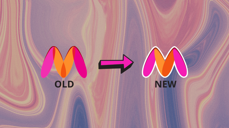
The new logo did not attempt reinvention. It focused on correction and control.
The earlier mark was fluid and slightly abstract. The redesigned version kept the core “M” but adjusted its structure. Edges were refined. Proportions were stabilised. The visual tension was reduced without losing recall.
This is what makes it a strong logo redesign case study.
Nothing dramatic changed in colour. The identity remained recognisable. But the form felt more intentional. More aligned with global logo simplification trends where brands move towards clarity and scalability across screens.
From a branding agency viewpoint, this is smart restraint. Radical redesigns risk memory loss. Incremental refinement protects equity while signalling maturity.
More importantly, the change supported the broader Myntra visual identity evolution. The cleaner mark translated better across app icons, push notifications, packaging and digital placements. It felt sharper in small formats, which matters for an app-first business.
The redesign was not loud. It was disciplined. And discipline, in branding, often communicates growth more effectively than noise.
Beyond the Logo: Myntra Visual Identity Evolution
The logo change was visible. The deeper shift was systemic. After the redesign, the platform experience began to feel more controlled. Less cluttered. More fashion-forward.
This phase of Myntra’s visual identity evolution showed up across touchpoints:
- Cleaner app interface
- More structured typography
- Reduced banner aggression
- Stronger focus on curated edits
- Elevated campaign photography

The platform slowly moved from sale-heavy communication to trend-aware storytelling. The emphasis was no longer just on “how much off” but on “what’s relevant”. That shift matters in a fashion e-commerce rebrand.
Because in fashion, perception builds value. When discovery feels curated instead of crowded, the brand begins to look like an authority rather than an aggregator. For a digital marketing agency, this is the key insight. Visual identity is not only about a logo file. It is about how consistently the system behaves across screens.
Myntra did not stop at redesigning a mark. It recalibrated how the brand showed up.
From Marketplace to Fashion Authority: Repositioning the Brand
The real shift in Myntra branding was not graphic. It was strategic.
Earlier, the platform competed on assortment and discounts. Growth was driven by events like End of Reason Sale. Traffic spikes mattered more than long-term perception.
Post-rebrand, the communication began leaning into fashion credibility.
You could see it in:
- Editorial-style content inside the app
- Trend reports and curated collections
- Influencer-led storytelling
- Premium brand collaborations
- Stronger visual consistency across campaigns
This is where the consumer perception shift becomes important.

A marketplace says: we have everything. A fashion authority says: we know what matters.
That difference changes pricing power, brand memory and loyalty.
For a branding agency, this is the core takeaway from the Myntra logo change branding strategy analysis. The redesign created space for repositioning. And repositioning, when done gradually, feels organic rather than forced.
The logo announced change. The content reinforced it.
Consumer Perception Shift and Competitive Pressure
Rebrands are only meaningful if perception moves.
In Myntra’s case, the consumer perception shift was gradual but visible. The platform began to feel more curated, more confident and less chaotic. It still ran sales. It still scaled aggressively. But the tone felt more controlled.
At the same time, the competitive environment was tightening.
- D2C fashion labels were building strong identities
- Global UX benchmarks were influencing Indian consumers
- Premium marketplaces were raising aesthetic standards
- App fatigue was increasing, forcing cleaner experiences
In that context, a fashion e-commerce rebrand was not optional. It was defensive and strategic at the same time.
As a Flipkart subsidiary, Myntra also had to maintain distinction. It could not afford to feel like a generic commerce platform. It needed fashion-led credibility.
The rebranding did not slow Myntra’s momentum. In fact, scale and positioning began to align more clearly.
Post-rebrand indicators include:
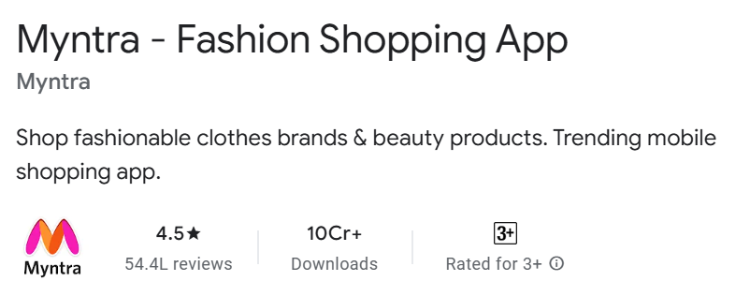
- 100M+ app downloads on Google Play Store
- Continued expansion to 5,000+ brands on the platform including premium and global labels
- Record-breaking editions of End of Reason Sale with millions of shoppers participating
More importantly, premium brand participation increased. Global and aspirational labels strengthened their presence, signalling improved fashion credibility.
The brand moved from being seen primarily as a discount platform to being positioned as India’s leading fashion destination
For a branding agency, this is where timing becomes everything. Rebranding too early wastes momentum. Rebranding too late costs relevance.
Myntra changed when the market was shifting, not after it had shifted completely.
That difference protects leadership.
Conclusion
The Myntra branding shift was never about a logo alone.
Yes, the redesign made headlines. Yes, it triggered conversation. But the real movement happened underneath. The cleaner mark aligned with a broader Myntra visual identity evolution, a more controlled app experience and a clearer ambition to be seen as a fashion authority rather than just a discount marketplace.
From a branding agency perspective, this is what makes the logo redesign case study worth analysing. The brand did not overreact. It refined. It used a public moment to strengthen long-term direction. That is strategic maturity.
For any digital marketing agency or marketer studying this, the lesson is simple. Rebrands work when they signal alignment between identity and ambition. Myntra did not just simplify a logo.
It simplified its message about who it wants to be.
Frequently Asked Questions

Vasim Samadji is a partner at Flora Fountain, where he leads the Business and Marketing Strategy divisions. In a world where everyone is used to sugarcoating, his directness is often considered rude. But that shouldn't be a problem if you like the no-nonsense approach. Because he is a seasoned professional...