

Located in one of Ahmedabad’s fastest developing areas, Shivashish World School (SWS) is a premier co-educational school which started back in the year 1994. A charitable trust started the school with Gujarati medium but with time the school got its CBSE affiliation and introduced English medium. In the year 2021, they went through a major expansion and re-branding exercise, which included a completely new building, identity design and re-doing their digital presence across website and social media.
The school wanted a total revamp of their design and branding, so one of Ahmedabad’s best digital marketing agencies came up with a best in class website to help them achieve a complete image makeover.
The Client’s Problem
Incepted more than 28 years ago, SWS has been imparting high-quality education from kindergarten right to high school. In 2021, they set up a new world class building for their CBSE board, but realized that in the post-pandemic era, most parents were going to discover them online first. Unfortunately, their existing website did not match the scale and aesthetic of the new building. The website was also being used for two different brands, the Gujarat Board school, called Shivashish School, and the CBSE school, called SWS, creating confusion for the user.
Moreover, the old website had been designed primarily for the desktop, with its mobile version created almost as an after-thought. However, a quick look at their analytics showed that up to 90% of their unique users accessed the website through mobile devices. All of whom were being served a sub-par experience.
The school also realized that most of the things that made them unique, such as their pedagogy, amenities and most of all its teaching staff had to be showcased better!
 The history of the school as presented in old website
Solution presented by Flora Fountain
Since most parents were accessing the website from a cell phone, we decided to create a mobile-first website, a first for any school in Ahmedabad, that was dynamic and sleek. Modern design concepts like glassmorphism, neumorphism, micro animations, extensive use of swipe, and an almost app-like UI were identified to create a modern website matching the new identity of the school. In order to accomplish this, we decided to design and develop a completely new mobile-first website, which was a first for any school in Ahmedabad.
 Neomorphism in the footer of the new SWS website
Phase 1: Analysis
According to research, 61% of mobile users are more likely to contact a local business if they have a mobile-friendly site. That means, more than half of the target audience, parents, would look for schools in their locality on their phones. So on the basis of the research conducted on their website usage and research on the new mobile web technologies, we listed some points to work on.
1) There was a lot of information available for parents, students, and teachers. So the information architecture of the old website needed to be fleshed out better for users to easily navigate through the website.
2) The new website had to reflect and highlight current school values, while at the same time showcasing the facilities and amenities of the new school building, the talents of its students and most importantly, its teaching staff.
3) The new website had to be Search Engine optimized, or SEO optimized, to improve the school’s reach on search engines online
4) The new website had to provide an intuitive and delightful responsive experience for all its audience, especially those accessing it through mobile devices
5) The new website had to be created on a user-friendly CMS like so the client could edit the content and images on their own going forward
Phase 2: Ideation & Implementation
Committing to a Mobile-first approach
After gathering and analyzing the data and noting that parents would be the target audience and that the site should be easy for them to use, we went ahead with our original idea to create a mobile-first website. This means that our product and design team starts by creating wireframes and mockups for mobile first. This means thinking of a more modular layout than a grid-based one. The modules can then be rearranged to create layouts for desktop and mobile.
Neumorphic, Glassmorphic, Animated
The second idea was to incorporate Neumorphism, Glassmorphism and animation in the user interface or UI. Once the wireframes were sketched, our design team created mockups using these two effects on all the various elements that make up a website, right from buttons and tabs, to images and navigation elements. Each page was painstakingly mocked up so there was no room for error while coding. A document was created for all the animation with adequate references.
To implement Neumorphism all this, the front-end team placed UI elements behind a background in CSS, to make it seem like components such as buttons are actually housed inside the background. For the frosted-glass effect of Glassmorphism, a blur effect was added to the background. Contrasting and vivid colours are used in the background to highlight the blurred transparency, giving a subtle border to the translucent objects. For animation we relied on extensive use of jQuery’s animation libraries.
Creating content through writing and photo & video shoot
Since we had put our heart and souls into designing and developing the website, we realized that we would also be the best people to create content for it. We wrote SEO-optimized content using the information provided by the client, adding all relevant meta tags and keywords on each page to target audiences in the nearby 5 km radius. Since that is the most parents are willing to travel to send their kids to school. We also realized the need for high quality photographs and images to bring this vision to life. So we conducted a shoot to get the right expressions of each child and teacher for the website. We also shot scripted videos with the children each presenting school values in an irrepressibly cute way. We overlaid sketched illustrations on some images to give them an element of storytelling. Finally, we added GIFs for each teacher to give the website a fun approachable vibe.
Testing
We extensively tested this website across top 10 mobile devices used by parents, with at least 5% of the website traffic percentage, such as Samsung Galaxy phones, Vivo, Oppo, Google Pixel, OnePlus and Apple iPhone. In addition to this we also tested it across popular desktop browsers such as Chrome, Firefox, Edge and Safari.
Result:
And viola, just like that the new website turned out to be as awesome as we had dreamt on paper and Illustrator 🙂
Let’s take a look!
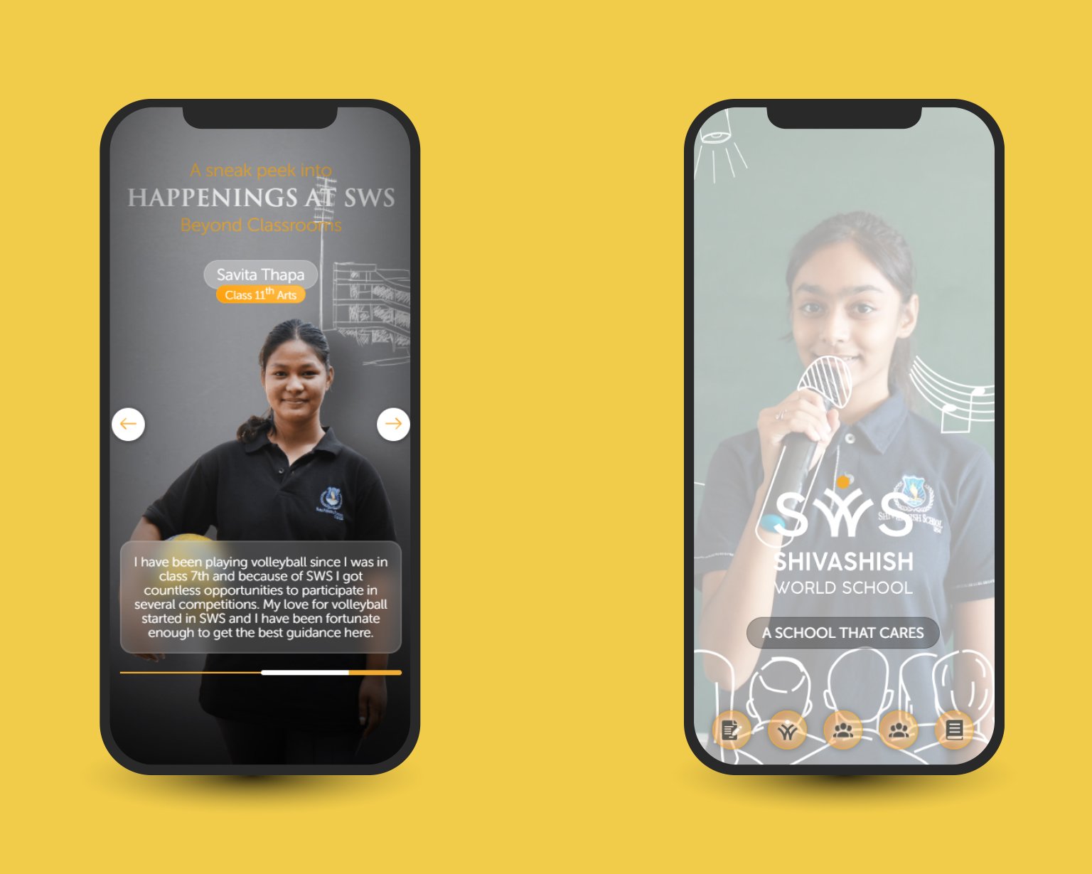
 Neumorphic, Glassmorphic, Animated visuals on the new SWS website
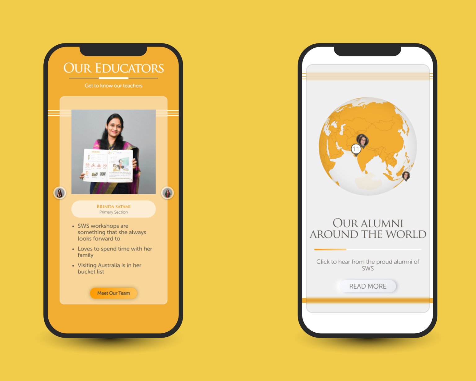
The new website highlighted the teachers and the students in a quirky and creative way, in line with the client brief.
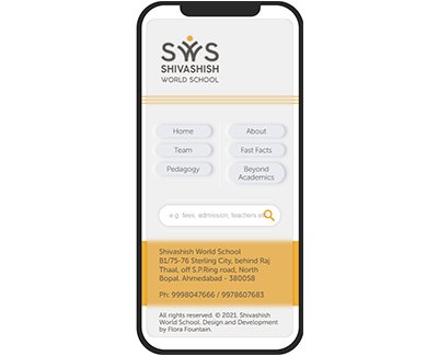
 Mobile friendly views of the new SWS website
It showcased the history of the school in a fun and more accessible way, than the usual text format.
And here is the highlight of the website! A 3-d globe showing the alumni of the school spread across the world.
Want to explore this website some more? Check it out here.
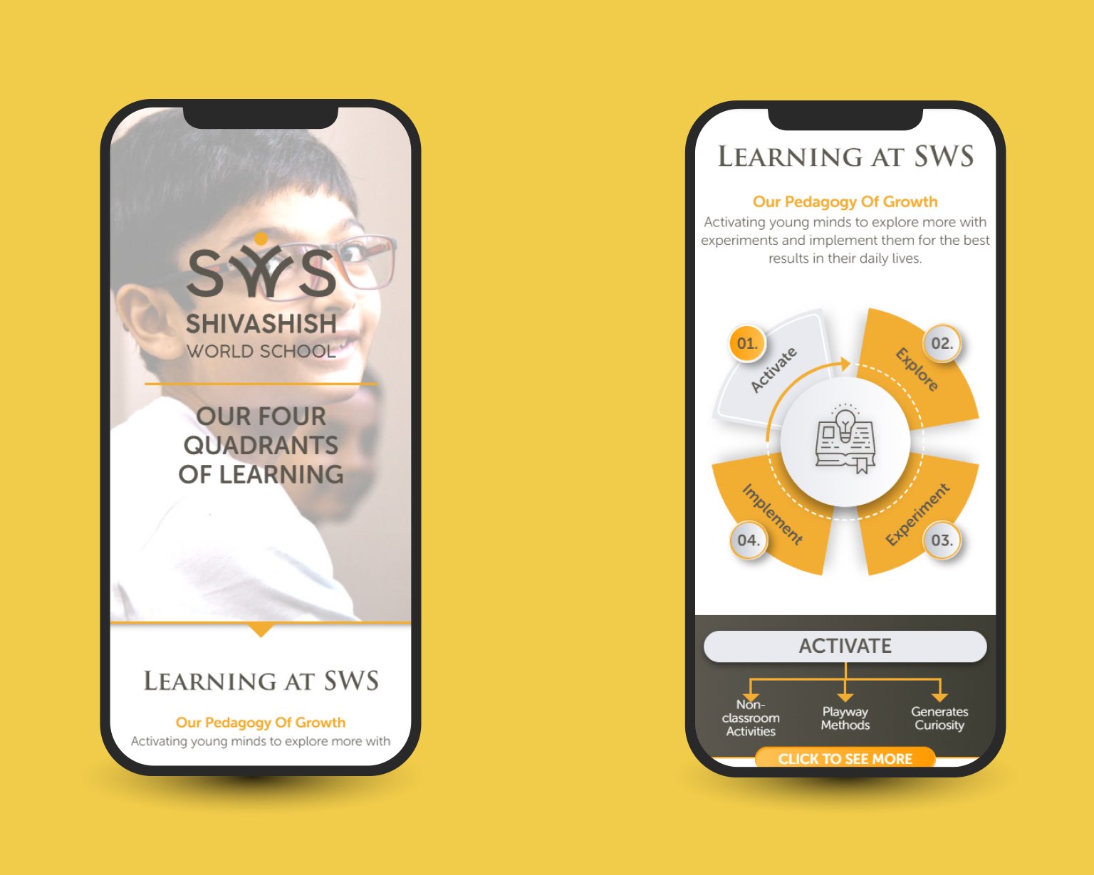
 Mobile friendly views of the new SWS website
So this is how Ahmedabad got its mobile-first school website! Time for your brand to do the same! If your brand needs a kickass and memorable website that works equally well on mobile as it does on desktop, one of the best and most thoughtful website development companies in Ahmedabad, Flora Fountain is here for you! Drop us an email on hello@florafountain.com or call 9558079502!
The founder and partner of Flora Fountain, Shefali leads the Content and Technology divisions. A one-time engineer who started her career writing front-end code, she took a detour sometime during her 9 years in New York, studied journalism and started writing prose, poetry and sometimes jokes. She now has 15...