Are you spending hours on SEO, watching your website traffic soar, but feeling stuck when it comes to conversions? Well, first off— high-fives for crossing that initial hurdle of ranking your website.
Now, let’s focus on turning those visitors into customers.
And hey, a huge shoutout for stepping out of your comfort zone and wanting to learn something new! In this blog, you’ll discover strategies to help boost your conversion rate
and make the most of all that traffic.
Let’s get started!
Table of contents
- Understand the Conversion Process First
- Follow Different Strategies for Different Sets of Audiences
- Run A/B Tests to Make Sure Things are Working
- Keep Lead Forms Short
- Think About Improving a User’s Experience on Website
- Utilise Urgency and Scarcity Tactics (But Be Authentic)
- Improve Page Relevance With Targeted Content
- Use Social Proof and Testimonials To Build Trust
- In Conclusion
- Frequently Asked Questions
1. Understand the Conversion Process First
Before you dive into tactics, you need to know your customer’s journey. Your traffic doesn’t magically convert into leads just because it lands on your site.
Think of conversion as a well-mapped path through a series of steps that guide your visitor from being interested to being invested.
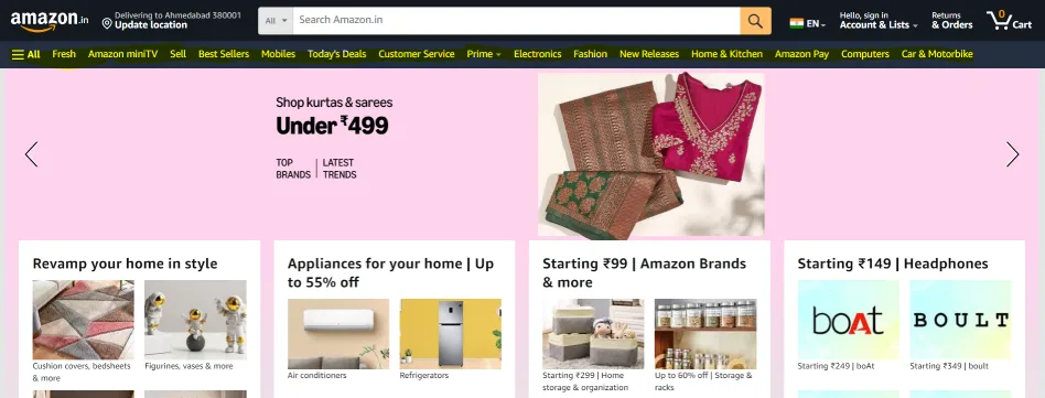
Imagine you’re working for a company selling ethnic wear online. The customer may start by searching for “best sarees for weddings” and land on a blog page.
From there, the blog leads them to the catalogue, then to the product page and finally to the checkout or lead form.
That’s how a typical conversion journey is. But if you’re struggling to convert the traffic that visits your website— it’s likely there’s a problem in your funnel.
Visitors are dropping off somewhere before completing the action you want them to take—whether that’s signing up for a demo, filling out a contact form or making a purchase.
Use tools like Google Analytics to check where users are dropping off. Are they leaving at the blog-to-product page transition or during checkout?
Identifying these leaks will tell you where you should put in more effort or how can you refine your strategy further.
2. Follow Different Strategies for Different Sets of Audiences
Not all the users that visit your website are the same. There are high chances that they have different needs, pain points and intentions.
For example, when someone lands on an e-commerce apparel website, their expectations can vary based on their stage in the buying process.
A first-time visitor might be browsing for ideas or looking for specific deals, while a returning customer could be ready to make a purchase or explore the latest collection.
You must understand this difference and create your strategy accordingly.
Let’s say you’re running an e-commerce store selling ethnic wear. A first-time visitor might be interested in learning more about the quality, styles and designs available. They might need to see user reviews, lookbooks or testimonials to trust your brand.
On the other hand, a returning visitor might already be familiar with your collection and could be searching for a specific product or a time-sensitive offer.
You shouldn’t show both user types the same landing page.
You could direct a first-time visitor to a landing page featuring your most popular collections and customer reviews to build trust.
Meanwhile, a returning visitor might be greeted with personalised offers, such as a limited-time discount on the items they viewed earlier or reminders to check out your newest arrivals.
For doing this, you need to first segment your audience by traffic source, location or behaviour on-site.
Then, use this data to create landing pages that match their interests.This will increase the chances of conversion as you are catering to their specific needs.
3. Run A/B Tests to Make Sure Things are Working
Let us break it to you—testing doesn’t just apply to headlines or button colours.
Try to go deeper and test everything from form length, image placement and user flows to the impact of testimonials or social proof for increasing your conversion rates.
Let’s say you’re working at a digital marketing agency in Mumbai. You are working on bringing leads for the agency by targeting mid-sized businesses.
You can A/B test two versions of your lead capture form. One asks for the business size and industry, while the other focuses on the user’s immediate needs (e.g., “Want to Grow Online But Don’t Know How? Reach Out To Us”).
Over time, you’ll see which version delivers better leads and adjust accordingly.
You can also try testing different types of CTAs based on user segments.
For example, first-time visitors might respond better to a “Learn More” button, while return visitors might be more inclined to click on “Let’s Connect”
4. Keep Lead Forms Short
Forms are usually the last step before someone becomes a lead. If they’re too long or intrusive, they’ll scare off potential leads.
Forms should only ask for what you need to know right away—less is more if you want those conversions.
If you’re collecting leads for a digital marketing agency, asking for full company details upfront is unnecessary.
Instead, go for a simple form that collects the visitor’s name, email and perhaps their marketing goal. Once the lead is warmer, you can ask for more details.
A pro tip — Try to include social proof near your forms.
Testimonials, case studies and the number of happy clients can reassure visitors. For instance, “Join 500+ businesses who’ve already boosted their online sales with our solutions.”
5. Think About Improving a User’s Experience on a Website
Traffic won’t convert if navigating your site is confusing or frustrating.
Factors like page load speed, intuitive navigation and easy-to-find CTAs can make or break your user’s journey.
Suppose you are working on an e-commerce fashion brand in India.
Imagine your users come to your product page, but the “Buy Now” button is buried beneath tons of product specs.
Even if they were ready to buy, the difficulty in finding the CTA button might stop them in their tracks.
Show the website to different people and ask them if they are able to navigate easily. This will give you an insight into the user experience. After that, you can suggest the team to work on the same.
6. Utilise Urgency and Scarcity Tactics (But Be Authentic)
Creating a sense of urgency can nudge a user into action. Scarcity is another psychological trigger that works wonders. However, you must ensure that these tactics are authentic.
Faking urgency or scarcity can hurt your brand credibility. So avoid that.
Let’s understand how to create urgency with an example.
For a moment think that you’re working with a SaaS client offering marketing automation tools. In that case, you can create urgency by promoting a limited-time discount on their premium plans.
A message like “Sign up within the next 48 hours to get 30% off your first year” paired with a countdown timer on the pricing page can encourage faster sign-ups from hesitant users.
7. Improve Page Relevance With Targeted Content
The more relevant your landing page is to your visitor’s search intent, the more likely they are to convert. One mistake most SEO professionals make is focusing solely on keywords for traffic generation without thinking about how that traffic interacts with the content once they arrive.
Imagine someone searches for “best laptops under ₹50,000” and lands on your website. Instead of bombarding them with the top 50 laptop options, create a highly focused landing page with curated suggestions. And see if it’s easy to understand.
Add comparison charts, FAQs or even video reviews to help the visitor make a decision faster.
If your traffic is coming from a variety of keywords, build dedicated landing pages for each cluster. Even if you need to create 5 different landing pages, don’t worry. Because businesses with landing pages as many as 10-15 pages see a 55% increase in their conversion rate.
You can create a page for “best laptops for gaming under ₹50,000” and another for “best business laptops under ₹50,000.” Specificity equals relevance and relevance boosts conversions.
8. Use Social Proof and Testimonials To Build Trust
In a country like India, where word-of-mouth marketing plays a huge role, showing your visitors that others have benefited from your services or products can create trust and increase conversions.
Testimonials, user reviews, case studies or even video reviews can help you build credibility.
We have done the same by highlighting the results we bring for our client. You can take a look here

Conclusion
Not getting leads despite high traffic can be frustrating, but don’t let it get you down. Instead, view it as a chance to learn and improve.
Start by understanding the buyer’s journey. Think about how you can address their pain points and meet their needs. Once you have a grasp of their behaviour, segment your audience accordingly. Then, create tailored landing pages for each segment that directly address their concerns.
Also, double-check that your “Buy Now” button or lead form is easily visible and not hidden away.
We hope these strategies help you start seeing those conversions roll in!
Cheers!


