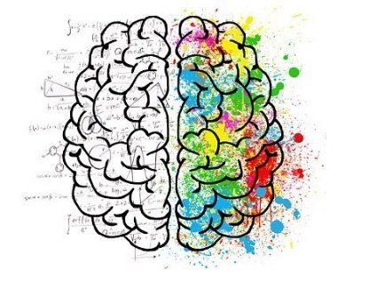
There are so many instances where one sees a colour and associates it with or recognises the brand. The colours not only help bring out the personality of the brand but it also helps evoke an emotional connection. It attracts people and lets them know more about you. Whether you are starting or expanding your company, here are some key points you should have in mind.
The right colour matters!

Call it colour psychology, but according to research, customers will make a subconscious decision based on colours. One has to choose their brand and logo colour wisely and see what message they deliver indirectly. The colours represent the brand personality which can range from being feminine or masculine, playful or serious, modern or classic, loud or subdues etc. The colours attract customers to choose you. For example-
The famous Starbucks, with its green colour makes it look rich, welcoming, friendly, and healthy. A lot is translated about their coffee and services.
Dark blue is heavily seen in a lot of motor and technology brands. The corporates love it but don’t forget the medical and healthcare industry which uses light blue. It is a safe colour as research shows that a lot of people’s favourite colour is blue.


One can never forget to mention McDonald’s. The yellow catches the eye immediately and is visible clearly in daylight while the red is an active colour. Well, yellow is also related to happiness. You can spot other food brands too using red in their logos. Your colours communicate what you stand for. Knowing what the colour denotes in different cultures and places is important.
How to choose the right colours?
After you have decided on what your brand wants to emote and what your personality is, you have to decide on the background, base and accent colour. Looks like a lot, but it’s not. Consider this a method for you to arrive at the right colours for your brand. With a wide range of colour options, your brand requires the right shade. Hence, deciding on the background, base and accent colour is important.
- Your background colour scheme has to have options.
- The base colour shows your personality and appeals to the target audience.
- The accent colour has to complement and pair well with your background and base colour.

For the logo design you can spin the wheel. Take a look at the picture and see where you fit in, which shade and colour is right for you.
- Monochrome when you are focusing on one personality trait.
- Analogous is safe as you convey the same meaning and connotations.
- Complementary colours would mean bold and dynamic visuals.
- Triadic colours are stable but one has to see if it matches the brand personality.

Colourful names
Own your colour and its name too. It has been found that quirky and fancy colour names are more pleasing to people. Even though people were shown the same colour, mocha is preferred over brown. The colour brown can be bifurcated in cinnamon, cedar, brunette, tawny, tortillas, chocolate, gingerbread etc. Naming your unique colour makes it stand out. Create your own colour palette to establish the identity.
On the whole visuals affect the consumer. As a brand, one has to build trust and loyalty through its colours. It is important to analyse your competitors, know what your brand stands for and what personality traits it emotes. Choosing the right colour and associating it with your brand requires variations and background, base and accent colour. Making the right mixture and naming it is crucial. People are attracted to fancy names.
Flora Fountain provides branding and logo services. We help you build and enhance your logo designs too. Leading business into the new creative ventures and reaching success. There is no right or wrong, it is all about exploring and creating one’s colour palette. Get in touch with us today to know which colours suit your brand and how it will help you propel your positioning among your customers.


