So you want to make your customers sit up and take notice, maybe do a little dance of joy and discovery too? So you want to let them know your brand’s story, how different it is from all the competition out there? After all, in the 90s, there were lover boys and then there was Shakhrukh aka Rahul.
Enter BRAND LOGO
And just like in the movies, brand love does happen at first sight. And logos, being the metaphorical face of a brand, are often carriers of the brand’s first impression for new and future audiences. Logos are also a great way to distinguish your brand from other companies with similar products. So let’s dig a little deeper with the experts from one of Ahmedabad’s best-known logo design and branding agencies to find out all that a logo can be and should be…
Brand or pictorial mark
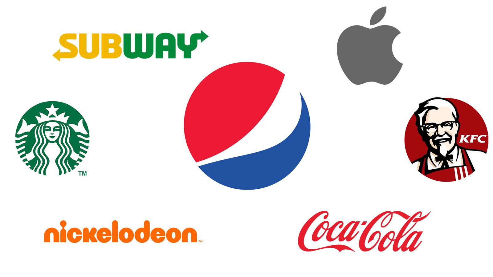
Made up of a graphic symbol or icon which represents a real-world object. A perfect example would be, Apple.
Abstract
Logos which consist of a unique symbol tailor-made for the brand, like the one for Pepsi.
Mascots
These logos are made of images of a character that act as a visual representation of the business, like Colonel Sanders in the KFC logo.
Emblem
Logos which consist of a typeface that sits within a border or a seal. For example, Starbucks.
Dynamic
These are adaptable logos, which change themselves according to the context in which they are being used, instead of having a standard font-color-text combination.
Wordmark
These logos consist of text only with company names, monograms or initials. Think Subway or Coca Cola.
Knowing the whole gamut of logo options, how does one choose which logo style works best for your business? Well, here’s how…
1. Do extensive research
You have only one chance to get the logo right! So, do it properly! And how can you do it? With the help of thorough research. Good research will show how you can explore different logos to create a perfect one for your brand.
Dig deep and research your competitors’ logos as well. Don’t do it, to copy from them, but rather to check what kind of design, scheme and layout they have. See what worked and what didn’t work for them. And with the help of your research.
You should show customers that you are unique and different. Plus, being too close to your competitors could be detrimental, and get you into legal trouble. Moreover, be clear of your audience and find out what colours or concepts work on them.
After your research, create a brand concept that reflects the ethos and goals of the brand.
2. Always have a story
Have you ever seen a big brand without a logo? No, because there isn’t one. Logo tells the story of the brand. And you need to create that story too.
When consumers see any brand logo, they are reminded of the stories of the businesses those logos represent. For example, when people see an iconic Golden Arches, they know it’s McDonald’s. It is a brand which people recognise without even seeing the name. The arches represent the newly-constructed architecture of the first franchised restaurant in 1952. Did you see? A story!
This is how companies which have logos connected to the company’s stories or mission are often the most successful.
3. Keep it simple
When in doubt, remove the extra elements!
Less is more, when it comes to logos. While, it’s fun to play with different colours, images and fonts but using too much of them will lead to a disaster. The more elements you add, the more complicated it becomes. And visually complex logos or overcrowded designs should always be avoided.
Rather than getting carried away with too many options, opt for a simple design with a clear brand message that will hit the right spot of your consumers. Choose the right colours and typography very carefully. It should be easy to read and should have a proper size and well-distributed spacing.
For example, Twitter. The bird with clean lines and blue colour is simple yet effective.
4. Dare to be different
Imagine going to an office party and ending up twinning with two of your colleagues. Do you think people will remember your outfit over someone who wore something different? That is why, in a world where there are no new ideas, your brand needs to have a unique logo which stands out from the crowd and make an identity different from the competitors.
Think out of the box, like Mercedes. The logo of Mercedes is not a car but a three-pointed star which represents the use of Daimler engines on the land, on the sea, and in the air.
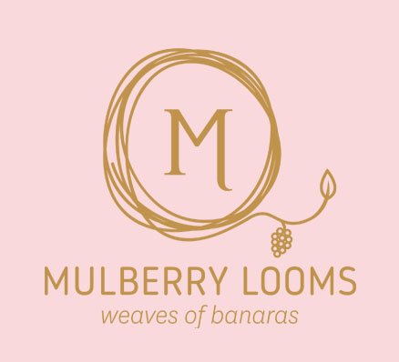
Similarly, a fashion brand of Ahmedabad, known as Mulberry Looms, decided to be different. How, you ask? The brand which crafts pure handloom Banarasi silk sarees, lehengas, among other outfits, does not choose to go for the cliché logos like a top of a woman. Rather it incorporated its weaves in the logo.Your goal should also be to make a logo connected with your brand’s values and aesthetics. Experiment till the time you come up with something totally innovative.
5. Choose a responsive logo
In this digital world, businesses are very lucky to have various platforms to promote themselves. Hence, the brand logos are not just limited to visiting cards, they are also visible online to the people sitting online on different devices.
Your logo should be very clear and distinctive on every platform. It should seamlessly fit on the plethora of devices used by consumers.
The best example for a responsive logo is Google. The logo reads full GOOGLE on larger screen and on small screen the logo is compact in its four distinct logo colours.
BONUS TIP
If you are out of ideas but still want a distinctive, original, and intriguing logo, all you have to do is get in touch with the professional logo & Branding design services in Ahmedabad’s Flora Fountain.
Have a question? Drop us a message here. Experience the difference and enjoy the creative process with Flora Fountain. 🙂

