Pantone Colour of the Year 2025 has certainly sparked a lot of conversation across the design world. Some are loving the rich, warm brown hue, while others argue that it’s too plain or “boring” compared to previous, bolder choices. Whether you’re on team Mocha Mousse or not, one thing is clear — this shade might be everywhere this year.
Because of course, it’s the “Pantone” colour of the Year”.
And if you’re here you might want to dive deeper and know why it has caused debates and how you can use it in your designs.
Table of contents
- What Is Pantone 17-1230 Mocha Mousse?
- Why Has Mocha Mousse Led the Internet Divided?
- Let’s Learn More About the Colour
- Is Mocha Mousse the Answer for Minimalism Trend?
- Final Thoughts
What Is Pantone 17-1230 Mocha Mousse?
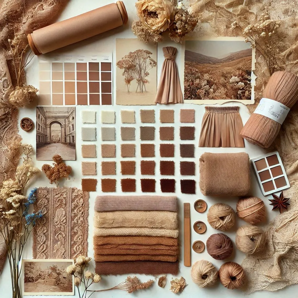
Pantone 17-1230, known as Mocha Mousse, is a soft, sophisticated brown that combines the warmth of chocolate and coffee with earthy elegance. It’s a hue that invokes comfort, indulgence and subtle luxury—perfect for the times when people are looking for something grounded but still rich in visual appeal.

Image Source – Pantone
Why Has Mocha Mousse Led the Internet Divided?
The internet has been buzzing with strong opinions since the announcement of Mocha Mousse as Pantone’s 2025 Colour of the Year. Some design enthusiasts are excited to try to incorporate it with other shades.


On the other hand, some feel it’s a bit too safe, especially after the vibrant choices in previous years.

And the comment gets even worse. Take a look at this post by Diet Prada for instance. The users have criticised the colour like anything.
View this post on Instagram
Its subtlety might appeal to minimalists, but it can also come across as uninspired if not executed properly. So, whether you find it boring or brilliant, you definitely can’t ignore it—Mocha Mousse is here to stay in 2025 and it’s up to you to make the most of it.
Let’s Learn More About the Colour
The Emotional Appeal of Mocha Mousse

Image Source: Pantone
At its core, Mocha Mousse is a colour that evokes comfort. It’s not flashy, but it’s deeply satisfying—like a visual hug. The richness of the shade makes it versatile and accessible, offering a sense of luxury without being flamboyant.
For brands looking to tap into feelings of warmth and indulgence, Mocha Mousse could be the perfect choice. It’s especially fitting for products and campaigns that want to showcase quality and sophistication in a subtle, approachable way.
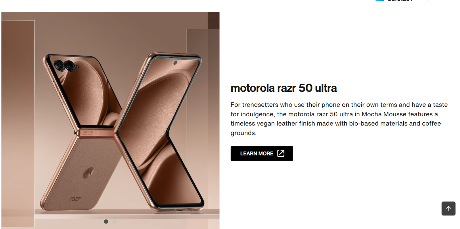
Mocha Mousse X Motorolla

Pantone didn’t just stop by announcing the shade. It actually collaborated with brands to show how this colour can be brought to life. And one of the most notable collaborations is with Motorola. It has embraced this shade in the design of their smartphone line. By incorporating Mocha Mousse, Motorola taps into the emotional appeal of this colour—suggesting a sophisticated tech experience.
For designers, this collaboration offers a great example of how a seemingly simple shade can elevate a product’s aesthetic and create a memorable brand image.
How Mocha Mousse Pairs with Other Colours
Pantone’s Mocha Mousse isn’t just a colour on its own—it’s part of a broader colour story. Pantone has curated five unique colour palettes to complement this shade, each evoking different moods. For designers, understanding how to pair Mocha Mousse with other colours is key to making the most of this versatile hue.
1. Uniquely Balanced

This palette merges warm and cool tones to create a dynamic, multi-dimensional feel. Mocha Mousse acts as a grounding element, allowing you to pair it with vibrant, exotic colours that demand attention. It’s ideal for projects that need a bold statement, like branding for emerging businesses or products that stand out in saturated markets. The versatility of this palette makes it a great choice for adding depth and richness.
2. Floral Pathways

Think of this palette as an invitation to spring. Mocha Mousse pairs beautifully with soft floral shades, evoking the warmth and freshness of a blooming garden. This combination can be ideal for projects that aim to bring a sense of vitality, renewal and optimism—whether that’s in fashion, interior design or personal branding. The contrast between the delicate floral hues and the rich Mocha Mousse brings a sense of balance that’s visually engaging but still approachable.
3. Deliciousness

Inspired by indulgent sweets, this palette combines rich tones like caramel, chocolate and creamy beige with Mocha Mousse for a sensory experience that’s both luxurious and comforting. It’s a palette that speaks to the love of fine confections and rich, indulgent textures. Ideal for high-end brands, food packaging or any design project where warmth and sophistication are essential. The colour harmony offers a sense of luxury, making it perfect for everything from upscale branding to product designs that require something vibrant but elegant at the same time.
4. Subtle Contrasts

In this palette, Mocha Mousse is paired with cool blues and greys, creating a sophisticated, timeless contrast. The muted, neutral tones of the palette, including shimmering beige, allow Mocha Mousse to shine without overwhelming the viewer. It’s a perfect choice for professional, corporate designs, minimalist projects or anything where a polished, premium feel is needed. This combination speaks to both reliability and refinement, ideal for industries where trust and sophistication are key.
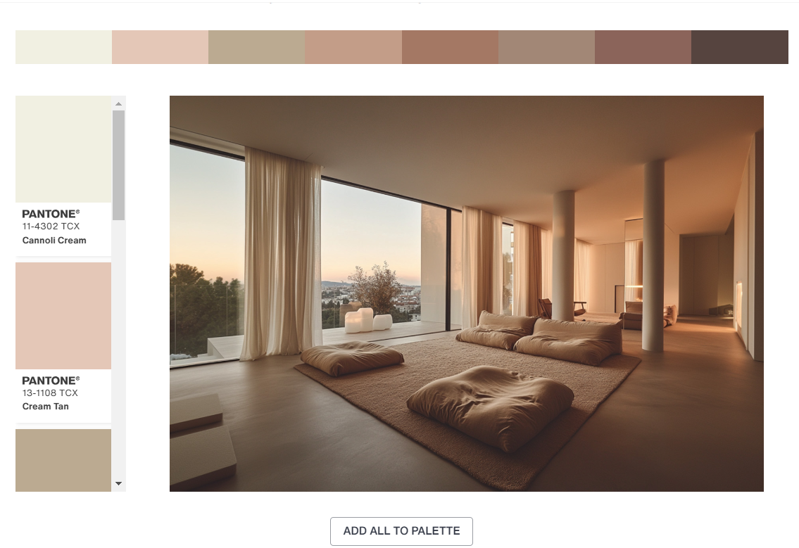
5. Relaxed Elegance

This palette is all about creating a serene, calming environment. Mocha Mousse is paired with soft beiges, creams and taupes, evoking a sense of quiet luxury and relaxation. The muted tones create a grounded yet sophisticated base, perfect for wellness brands, minimalist interiors, or lifestyle designs that emphasise comfort and simplicity. It’s a palette that helps to elevate the Mocha Mousse hue by blending it into a calm, refined aesthetic, ideal for creating a peaceful, inviting space or design experience.
These palettes show just how flexible Mocha Mousse can be, making it a versatile choice for different design projects.
Is Mocha Mousse the Answer for The Minimalism Trend?
There’s no denying that minimalism is still going strong in the design world. With its muted, earthy tone, Mocha Mousse is a perfect fit for minimalist designs that focus on subtle sophistication rather than bold statements. Whether it’s used in a logo, a website or a product package, this colour can add depth and warmth to designs without overwhelming them.
Final Thoughts
Pantone Colour of the Year 2025 — Mocha Mousse has mixed opinions. But we all have to admit that Pantone’s influence is real and the colour might be in this year. Whether you love it or hate it, this rich, warm brown offers a unique opportunity for you to play with texture, luxury and comfort in your work.
From branding to interiors to fashion, this shade provides endless possibilities for creating memorable, sophisticated designs. So, embrace the warmth and richness of Mocha Mousse and find your own way to make it shine in your next project
All the best!


