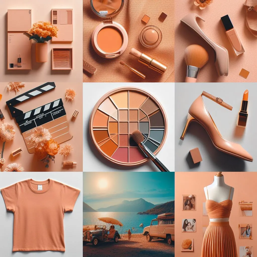
Are you pumped up for the New Year and the amazing parties ahead? Well, here’s a question to kickstart the excitement: Do you know the Pantone Colour of the Year for 2024? If you do, high-five! If not, brace yourself because you might be missing out on something HUGE.
But fear not, this blog is here to be your guide. It’s packed with all the details about the Colour of the Year and how you can effortlessly weave it into your logo, website, packaging or products.
So, what’s the holdup? Dive into the New Year Colour Party with us!
Table of contents
- What is Pantone?
- Pantone Colour of The Year 2024
- What Does it Mean for Brands?
- How Can You Incorporate The Colour in Your Business?
- Pantone Colour of The Year From 2001 to 2023
- In Conclusion
- Frequently Asked Questions
What is Pantone?
Pantone is an American company, often abbreviated as PANTONE. It is headquartered in Carlstadt, New Jersey. They are famous for their exclusive Pantone Matching System (PMS), a widely-used tool in various industries such as printing, manufacturing, fashion, product design and graphic design. The PMS facilitates colour management throughout the design-to-production process, covering both physical and digital formats. It works seamlessly on coated and uncoated materials, including cotton, polyester, nylon and plastics. Pantone is a go-to for ensuring consistent and accurate colours across diverse applications.
History
M & J Levine Advertising, the commercial printing firm founded by brothers Mervin and Jesse Levine set the stage for Pantone’s story. Lawrence Herbert, a recent graduate from Hofstra University and specialist in chemistry joined the company as a part-time employee working for the founders. Utilising his background in chemistry, Herbert organised and streamlined the company’s pigment stock and coloured ink production. By 1962, he had turned the ink and printing division into a profitable venture, successfully overcoming the debt in the commercial display division.
Recognising the potential, Herbert made a significant move in 1962 by purchasing the company’s technological assets from the Levine Brothers for a sum of US$50,000 (equivalent to roughly US$480,000 in 2022). After acquiring the assets, he rebranded them as “Pantone.” This strategic decision marked the beginning of Pantone’s journey as a renowned authority in colour management.
How Colour of the year is selected
Since 2000, the Pantone Colour Institute has been choosing a special “Colour of the Year.” Twice a year, they bring together people from different colour organisations in a European city. The Pantone Colour of the Year is inspired by fashion, cinema, social and political changes and global events that mark the international scenery.
Pantone Colour of The Year 2024
Peach Fuzz or PANTONE 13-1023 is the Pantone Colour of The Year 2024. Pantone describes the chosen shade, a gentle orange-pink hue, as warm, cosy, subtly sensual and heartfelt.
Named “Peach Fuzz,” this velvety peach tone aims to symbolise our shared desire to nurture both ourselves and others, embodying an all-encompassing spirit that enriches the mind, body and soul. Leatrice Eiseman, Pantone’s executive director, conveyed this sentiment in a news release.
What Does it Mean for Brands?
Pantone’s Colours of the Year plays a significant role in shaping product development and consumer decisions across various industries, including fashion, industrial and interior design and product packaging. For brands, this presents a creative opportunity to integrate these trending colours into their product packaging, Instagram posts and website designs, ultimately giving them a competitive edge.
Motorola has taken the lead by being the first company to launch a product in the captivating Peach Fuzz colour. Check out their post below:
Here are some suggestions for brands on how they can use the Pantone Colour of the Year 2024 for their branding:
- Clothing companies can craft stylish garments in the trendy Peach Fuzz shade.
- Jewellery brands can curate a stunning jewellery collection featuring Peach Fuzz accents.
- Car dealers and car detailing businesses can suggest the idea of changing the colour of cars to Peach Fuzz for a fresh and unique look.
- FMCG brands can revamp their product packaging with the vibrant Peach Fuzz colour.
- Interior designers can recommend Peach Fuzz decorative pieces to add a touch of modernity to their clients’ spaces.
- Merchandising companies can offer a range of Peach Fuzz products to cater to the trend.
If brands find it challenging to incorporate this colour into their website or products, collaborating with a digital marketing agency in Gujarat is a great solution. These agencies typically have teams of experienced and knowledgeable designers, social media managers, writers and web developers who can assist in creating consistent designs and product packaging using the Colour of the Year 2024.
How Can You Incorporate The Colour in Your Business?
The in-depth colour trend research carried out by the Pantone Color Institute can save you loads of time on marketing research for your business. Once the new colour is announced in December, you or your designers should explore how it can be seamlessly integrated into your business.
Some creative ideas that you can use:
In web design
If you are in the process of making a new website for your brand, consider asking your web design agency to use the Peach Fuzz colour. If you already have a website, why not switch up the colour of your site and its pages each year, following the announcement of the Colour of the Year? Your web design company can even create a personalised colour palette featuring various shades of Peach Fuzz to present to your clients. It’s a simple way to keep things fresh and visually appealing!
In social media posts
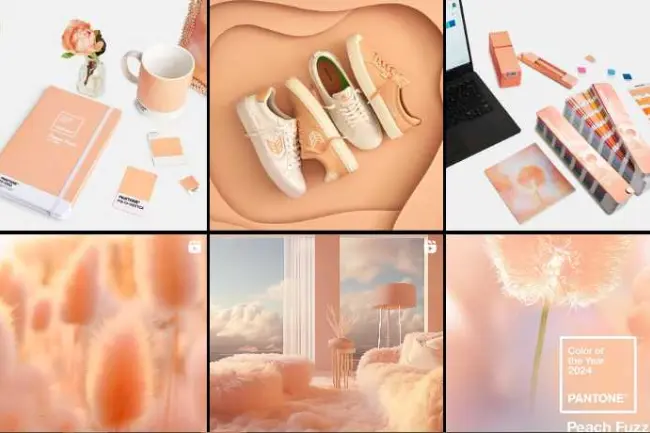
When you hop onto a social media platform and notice a steady colour theme in the posts, doesn’t it give off this pleasing vibe? That’s the magic of consistency – it levels up your branding game. For your business’s social media accounts, you can create a uniform palette using the colour of the year 2024. Apply these hues to your posts, giving your grid a visually appealing boost. Check out the Pantone example below for some inspiration
In products
Are you in the business of selling clothes, shoes or tea-drinking accessories like cups and vacuum flasks? How about giving them a fresh new look in the trendy Peach Fuzz colour? Imagine every year, you roll out a limited collection featuring the colour of the year. This not only adds a splash of excitement to your products but also sparks a sense of anticipation among your customers. They will be eagerly waiting to grab your latest offerings, creating a buzz.
Pantone Colour of The Year From 2000 to 2023

2000: Cerulean 15-4020
Powdery Cerulean was selected as the inaugural Color of the Year because it’s universally accepted, regardless of race, gender or nationality. The decision was influenced by the widespread use of blue in consumer products and its ability to symbolise the tranquillity and calm associated with the new millennial age.
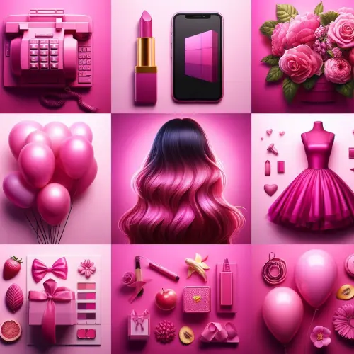
2001: Fuchsia Rose 17-2031
In this year, Fuchsia Rose, a colour associated with passion and intensity, took an unexpected turn.
2002: True Red 19-1664
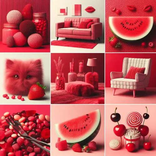
True Red was selected in 2002 as a patriotic commemoration of the 9/11 tragedies. On that dreadful day, true red was a forceful and strong colour that stood for the brave and the fallen.
2003: Aqua Sky 14-4811
Aqua Sky was chosen as the 2003 Colour of the Year because it is a serene, gentle shade that is supposed to evoke feelings of calmness and hope.
2004: Tigerlily 17-1456
Tigerlily, the 2004 Colour of the Year, was a vibrant combination of red and yellow designed to stimulate bold creativity. It was an example of how nature inspires design, and it was inspired by the same-named flower.

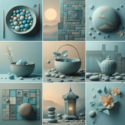
2005: Blue Turquoise 15-5217
The 2005 Colour of the Year was Blue Turquoise, carrying on from the previous year’s theme of natural inspiration. On a sunny, quiet day, the ocean’s colour is like this. True turquoise is warmer than blue turquoise because blue turquoise has less green in it.
2006: Sand Dollar 13 -1106
Sand Dollar was the 2006 Colour of the Year; it had a neutral vibe. It was selected to symbolise worries about the state of the economy at that time. Inspired of the desert and sandy beaches, this neutral hue is quite hot right now for interior design and fashion.

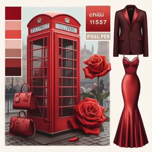
2007: Chilli Pepper 19-1557
The 2007 Pantone Colour of the Year was the first to be revealed together with a press statement describing its inspiration. The colour chilli pepper symbolised fiery passion and an adventurous spirit.
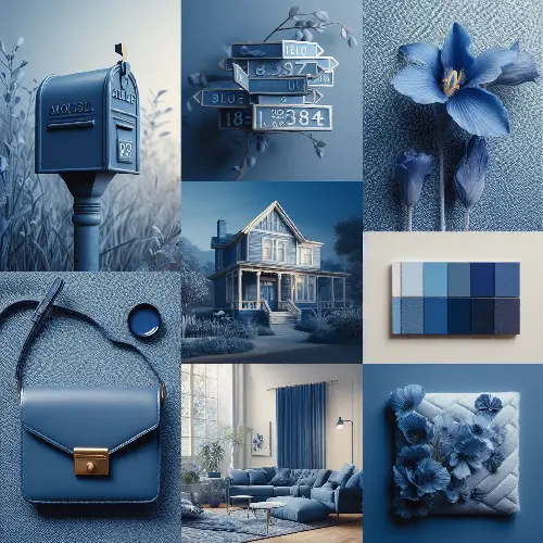
2008: Blue Iris 18-3943
Blue iris was selected as the 2008 Colour of the Year due to its dazzling blue and purple properties, which encouraged meditation. It looked great when paired with rich plums and reddish-brown interior design.
2009: Mimosa 14-0848
The mimosa flower, the champagne and orange juice cocktail inspired the 2009 Pantone Colour of the Year, mimosa. In uncertain economic conditions, mimosa was considered a vibrant and vivacious colour that encouraged creativity.
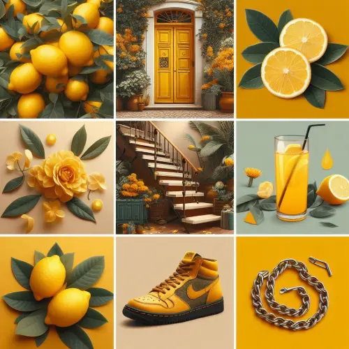
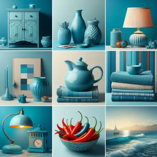
2010: Turquoise 15- 5519
The 2010 Colour of the Year, Turquoise, was associated with both powerful, protecting talismans and a serene tropical paradise. Because it was viewed favourably by men and women, turquoise was a significant hue. The colour went nicely with earthy tones and matched perfectly with accessories.
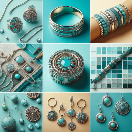
2011: Honeysuckle 18-2120
A striking shade of pink Honeysuckle was the Colour of the Year, 2011. It evoked joy, bravery and self-assurance for daily life. With certain benefits shared by its warm sister colour, red, honeysuckle was a good, wholesome hue.

2012: Tangerine Tango 17-1463
The year 2012 was symbolised by the colour Tangerine Tango. Deep, sensual and reminiscent of an oceanside sunset, this colour was showcased alongside designers such as Tommy Hilfiger and Nanette Lepore in the Spring 2012 fashion show
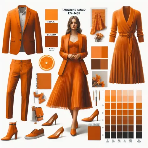
2013: Emerald 17-5641
2013’s Colour of the Year was Emerald, a shade of jewels. This deep green was lavish, chic and elegant; it stood for rebirth, regeneration and revitalisation. Emerald’s pleasing tone made it ideal for interior design for both fashion and homes. Emerald was also used in a collection called “Sephora + Pantone Universe™ 2013 Color of the Year beauty collection,” which included eyeshadow, nail polish and accessories.

2014: Radiant Orchid 18-3224
Radiant orchid was a colour that encouraged uniqueness and inventiveness in 2014. It was charming and gave courage. 2014 saw Radiant Orchid make advances in both beauty and fashion. Designs for both men and women featured Radiant Orchid, from the red carpet to the runways.
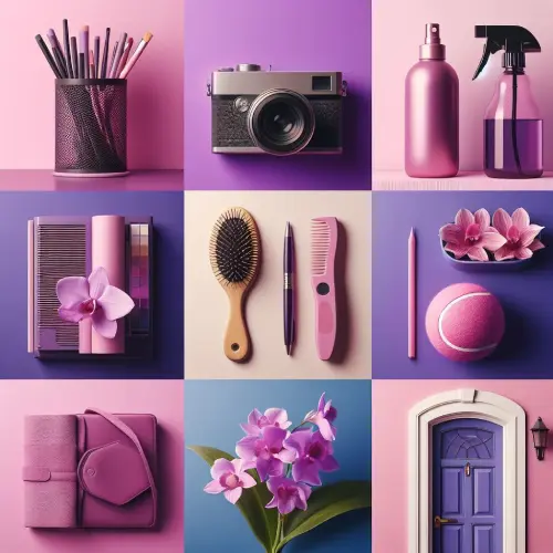
2015: Marsala 18-1438
Radiant orchid was a colour that encouraged uniqueness and inventiveness in 2014. It was endearing and gave me courage. 2014 saw Radiant Orchid make advancements in both beauty and fashion. Designs for both men and women featured Radiant Orchid, from the red carpet to the runways.
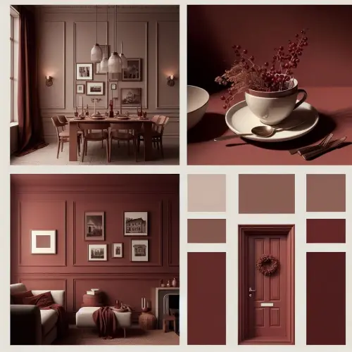
2016: Rose Quartz and Serenity 13-1520 /15-3919
The Pantone Colour of the Year in 2016 was two hues. Rose quartz and Serenity represented the pursuit of health and tranquillity. The contrast between the chilly blue and the warm rose tone challenged conventional colour perceptions that associate colour with gender. The double colour symbolised the expanding gender-neutral trend in fashion and how it affected other design elements.
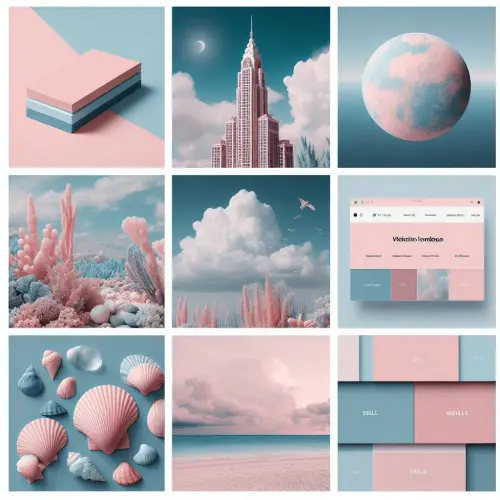
2017: Greenery 15-0343
Greenery was the Colour of the Year 2017. Also known as “nature’s neutral,” greenery symbolised fresh starts and the approach of spring. The concept behind Greenery is that people will picture the great outdoors and the call of nature when they see the colour. The increase of greenery in architecture, urban planning, fashion and lifestyle choices is reflected in the use of greenery.
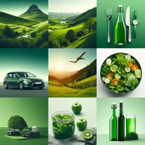
2018: Ultra Violet 18-3838
Ultra Violet was chosen as the 2018 Colour of the Year. The colour Ultra Violet, which stood for “what is to come,” symbolised the mystique of the universe, the value of creativity and imagination, the strength of the unknown and the pursuit of knowledge.
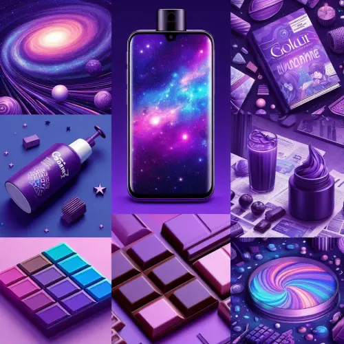
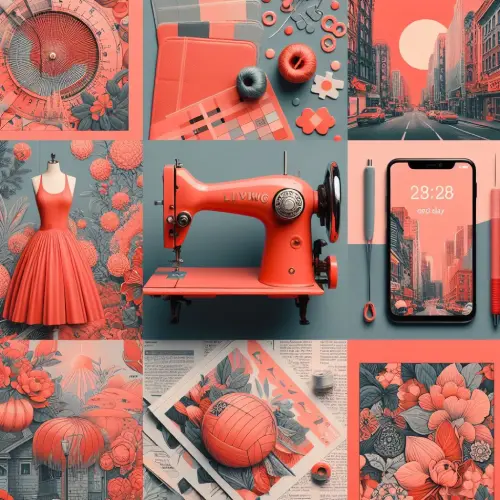
2019: Living Coral 16-1546
Not every Colour of the Year had the same impact on people as Living Coral did in 2019. All year long, coral hues were popular in makeup; coral clothing was featured on fashion runways for every season; and coral fabrics and wallpaper were popular in home décor. When Apple unveiled a new phone in the same colour just a few months before the Color of the Year was revealed, it was a welcome surprise.
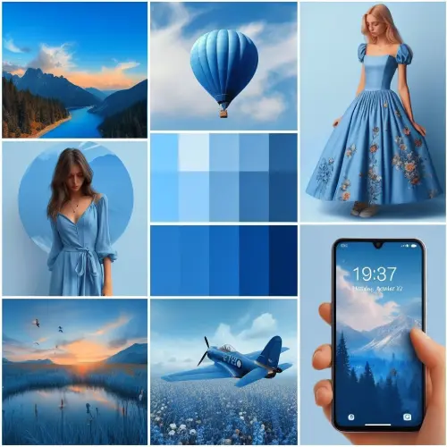
2020: Classic Blue 19-4052
The newest Color of the Year, 2020 was Classic Blue. The colour brings stability and confidence. This rich blue is ageless, sophisticated and classic. Given that it’s a colour we frequently see, the viewer may find this colour to be a little unexpected in its feelings.
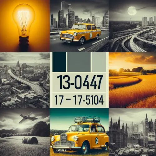
2021: Illuminating and Ultimate Gray 13-0647/ 17-5104
The Pantone Institute has selected two colours rather than just one for the second time in the last twenty-one years. The brilliant Illuminating yellow mixed with the sturdy and trustworthy Ultimate Gray is a celebration of the human spirit. While aiming for hope, people are seeking some form of certainty and stability.
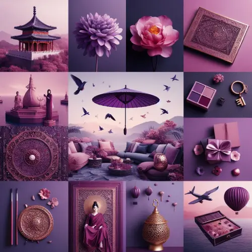
2022: Very Peri 17-3938
Periwinkle blue with hints of violet red, Very Peri combines the calmness of blue with the vivacity of red. The purpose of creating this new hue was to represent individual ingenuity and originality. Very Peri was all about a new personal reality for every one of us after two years of extreme transformation.
The reality that exists between our digital and physical worlds is more recent and interwoven. Because of necessity, our creativity has grown and Very Peri is here to empower and celebrate it.
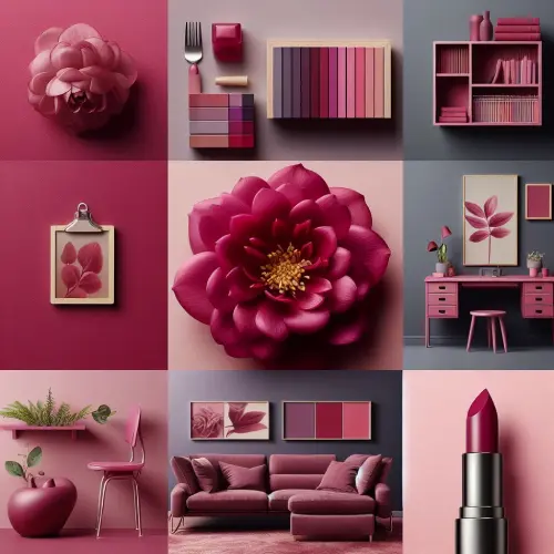
2023: Viva Magenta 18-1570
Viva Magenta is a rich crimson tone that is harmoniously blended with cool and warm undertones. It is seen as a hybrid colour that is bold without being overly aggressive. It is commended for capturing multi-dimensional design principles with its transformational red tones. It makes sense that Viva Magenta in late 2022 would be utilised in fashion and creative ventures; designers and creatives have embraced it swiftly.
In Conclusion
Start considering how you can infuse the lively Peach Fuzz colour into your business. Your customers will love the vibrancy, and it will keep them captivated. Want to make your products truly stand out and ensure your audience keeps coming back for more? Shoot us an email at hello@florafountain.com, and let’s have a chat over a cup of coffee – in a peach fuzz-coloured mug, of course!


