

A near-bankrupt toy company with $800 million in debt now generates more annual revenue than Hasbro, Mattel and Spin Master combined.
A pizza chain won customers back by going on camera and admitting its pizza tasted bad.
A fashion house once synonymous with counterfeit tracksuits became a £1.2 billion luxury powerhouse again. None of that happened because someone picked a nicer font.
Most rebrand round-ups won’t tell you any of this. They show you six logos, before and after, with a caption about how much “braver” the new one looks, and call it a day. Almost none of them explain what actually moved the needle, or separate a genuine business turnaround from a brand that simply got a facelift.
The six examples in this piece all share one thing the usual listicles skip: a real, measurable result behind the redesign. Revenue, market share, membership, sales growth, numbers a board actually had to report.
In short: the best rebrands of all time succeeded because they solved a real business problem rather than chasing a trend, protected the brand equity customers already valued, and delivered measurable commercial results, not just a more modern-looking logo.
Fast facts
| Brand | Year | Result |
|---|---|---|
| Burberry | 2009 | Revenue up 21%, crossing £1.2 billion for the first time |
| Old Spice | 2010 | Body wash sales up 125% year on year, became the #1 US brand |
| LEGO | 2004 to 2014 | Revenue roughly quadrupled from near-bankruptcy to the world’s largest toy maker |
| Domino’s | 2009 to 2016 | US pizza market share grew from 9% to 15% |
| Co-op (UK) | 2016 to 2017 | £61 million returned to members, alcohol sales up 21% |
| Dunkin’ | 2019 | Dropped “Donuts” from its name while keeping its core visual identity intact |
Table of Contents
- Burberry (2009): how a rebrand added £1.2 billion in revenue
- Old Spice (2010): the campaign that grew sales 125% without a logo change
- LEGO: how focus, not more products, built a multi-billion dollar turnaround
- Domino’s: rebuilding trust by admitting the product wasn’t good enough
- Co-op (UK): shortening a name and rebuilding member trust
- Dunkin’: dropping “Donuts” without losing brand recognition
- What do the best rebrands actually have in common?
- What should you be careful about copying?
- In Conclusion
- FAQs
Burberry (2009): how a rebrand added £1.2 billion in revenue
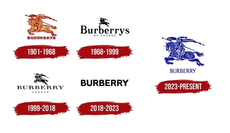
Burberry’s 2009 rebrand repositioned the brand away from an association with counterfeit goods and mass-market overexposure, helping revenue climb 21% to cross £1.2 billion for the first time.
By the late 2000s, Burberry’s signature check pattern had become so widely counterfeited and overexposed that the brand had drifted from luxury fashion house toward a symbol people actively avoided being seen in. This is one of the clearest successful rebranding examples of recovering from reputational damage rather than simple stylistic fatigue.
- The brand brought in Emma Watson as the face of the label, timed deliberately around her transition from Harry Potter into adult roles
- Marketing shifted from the oversaturated check print toward the brand’s trench coat heritage and craftsmanship
- Digital strategy was overhauled early, with Burberry becoming one of the first luxury houses to genuinely invest in social and digital-first campaigns, the kind of coordinated push a modern Digital marketing agency would now treat as standard practice for any major rebrand
The lesson here isn’t “hire a famous face.” It’s that Burberry diagnosed the actual problem, overexposure and reputational drift, and rebuilt around what still made the brand genuinely desirable, rather than reinventing the identity from scratch.
Old Spice (2010): the campaign that grew sales 125% without a logo change
View this post on Instagram
Old Spice’s “The Man Your Man Could Smell Like” campaign repositioned the brand from an older man’s product to a culturally relevant one without changing its logo or name, growing body wash sales by 125% year on year by July 2010 and making it the #1 men’s body wash brand in the US.
Worth flagging directly: this is a brand repositioning strategy rather than a visual identity rebrand; no logo or name changed. It earns its place here because it proves repositioning through message and tone alone can outperform many full identity overhauls.
The insight behind the campaign was specific: research found that 60% of body wash purchases were actually made by women, not the men using the product. Wieden+Kennedy built the entire campaign around speaking to both audiences simultaneously.
- Sales were up 60% by May 2010, just three months after launch
- By July 2010, sales had grown 125% year on year, against an original internal target of just 15%
- Twitter followers grew 2,700%, and YouTube subscribers more than doubled during the same period
The takeaway: sometimes the fastest, cheapest rebrand isn’t a new visual identity at all, it’s finding the audience insight the old identity had been missing.
LEGO: how focus, not more products, built a multi-billion dollar turnaround
View this post on Instagram
LEGO’s turnaround, beginning under CEO Jørgen Vig Knudstorp in 2004, took the company from roughly $800 million in debt to become the world’s largest toy maker by revenue within about a decade, driven by cutting products rather than adding them.
By 2003, LEGO had expanded into theme parks, clothing, video games and publishing, and was losing hundreds of millions annually despite strong revenue. This is one of the most cited brand turnaround examples precisely because the fix wasn’t more innovation; it was less.Domino’s: rebuilding trust by admitting the product wasn’t good enough
| What LEGO cut | What LEGO kept and doubled down on |
|---|---|
| Theme parks, sold to Merlin Entertainments | Core brick-based construction sets |
| Roughly half of all unique brick shapes and SKUs | Popular existing lines like City and Technic |
| In-house clothing and publishing ventures | Licensed partnerships, including Star Wars |
| Diversification for its own sake | Direct community engagement with adult fans |
Revenue roughly quadrupled between 2004 and 2014, and by 2014 LEGO had overtaken Mattel to become the world’s largest toy company by revenue. The company has continued growing since, reporting over $10 billion in annual revenue in recent years.
Domino’s: rebuilding trust by admitting the product wasn’t good enough
Domino’s 2009 “Pizza Turnaround” campaign rebuilt the brand by publicly admitting its pizza recipe needed to change, rather than simply refreshing its logo, helping US market share grow from 9% in 2009 to 15% by 2016.
This remains one of the more unusual rebranding case studies because most companies treat public self-criticism as a last resort. Domino’s made it the entire campaign.
- The brand ran ads featuring real, unscripted customer criticism of its existing pizza before unveiling a reformulated recipe
- Marketing leaned heavily into transparency, showing the actual product development process rather than polished advertising
- Domino’s became an early adopter of ordering technology, including one of the first major chains to accept orders through social media chatbots
The strategic principle here connects directly to what separates a genuine rebrand from a cosmetic one: Domino’s fixed the product first, then let the brand story follow the fix, rather than trying to talk its way past a problem customers had already noticed.
Co-op (UK): shortening a name and rebuilding member trust
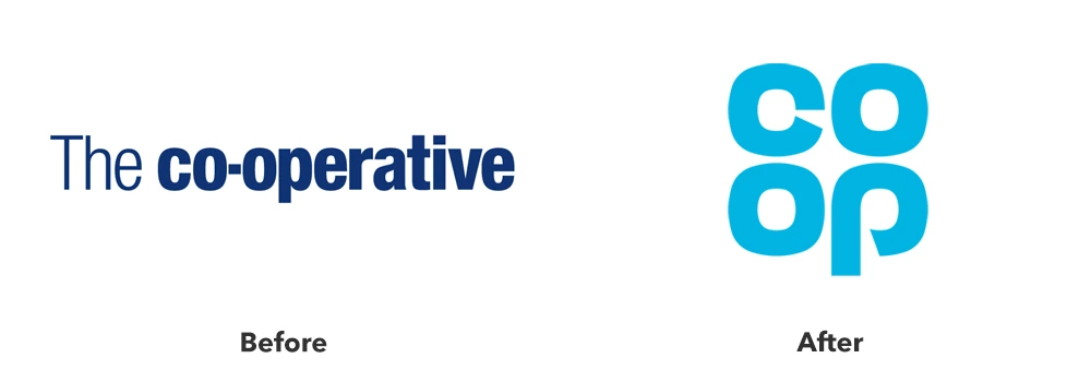
The Co-operative Group’s 2016 rebrand shortened its identity to “Co-op,” reintroduced its nostalgic cloverleaf logo, and rebuilt its “members first” positioning after a banking scandal, contributing to £61 million returned to members and a 21% increase in alcohol sales the following year.
This case matters because the business context was genuinely dire. The Co-operative Bank had lost £1.5 billion and its chairman had departed amid personal scandal, leaving the wider Co-op brand in real reputational trouble.
- The rebrand shortened “The Co-Operative” to the name people already used informally, “The Co-Op,” an easy, low-risk first win
- The reintroduced cloverleaf logo and blue palette deliberately triggered nostalgia for a more trusted era of the brand, one of the clearer logo redesign success stories on this list precisely because it looked backwards rather than chasing a trend
- New leadership re-adopted a genuine “members first” approach across messaging, in-store experience and community investment
In the year following the rebrand, Co-op operated at a profit, returned £61 million in member rewards, spent £13 million on community programmes, and packaging redesigns from agency Robot Food contributed to a 21% increase in alcohol sales alongside a 15% rise in active membership.
Dunkin’: dropping “Donuts” without losing brand recognition
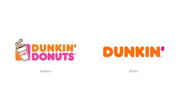
Dunkin’ Donuts shortened its name to simply “Dunkin'” in 2019, a change made possible because customers already used the shortened name informally through the brand’s own “America Runs on Dunkin'” tagline.
Unlike most of the examples on this list, Dunkin’ doesn’t have a single headline financial figure publicly tied to the rebrand specifically, so it’s included here for the strategic discipline it demonstrates rather than a stated metric. That discipline is worth studying regardless.
- The rebrand kept the brand’s core colour palette, typography style and store design largely intact, changing the name without discarding the visual equity built over decades
- The shortened name reflected an actual menu shift already underway, expanding well beyond donuts into a full all-day beverage and food destination
- Because customers already called the brand “Dunkin'” informally, the change removed friction rather than creating it
This is a useful contrast to Gap’s infamous 2010 failure: both companies changed a core brand element, but Dunkin’ evolved gradually and kept what customers already recognised, exactly the discipline a Visual identity design agency should bring to any name or logo change, while Gap replaced everything overnight.
What do the best rebrands actually have in common?
The best rebrands share three traits: they solve a genuine business or reputational problem rather than chasing a design trend, they protect at least one recognisable brand asset customers already value, and they measure success through real commercial results, not just design awards.
Looking across all six examples, three patterns hold consistently, and together they form a repeatable brand revitalisation strategy any established company can borrow from:
- They fixed a real problem first. Burberry addressed reputational drift, Domino’s addressed an actual product complaint, Co-op addressed a genuine trust collapse. None of them rebranded simply because the old look felt dated
- They kept an anchor. Dunkin’ kept its colours and typography, Burberry kept its trench coat heritage, Co-op deliberately brought back its nostalgic cloverleaf rather than inventing something new
- They had a number to point to afterwards. Every genuinely successful rebrand in this piece has a real, attributable business result, not just positive press coverage
This is precisely the discipline a Branding agency should bring to any rebrand conversation, starting from the actual business problem, not the mood board.
What should you be careful about copying?
Be cautious about copying a famous rebrand’s specific tactics rather than its underlying strategic logic, since factors like celebrity timing, cultural context or a company’s pre-existing brand equity rarely transfer directly to a different business.
This is the gap most rebrand listicles skip entirely, and it matters for anyone actually planning a change:
- Burberry’s Emma Watson partnership worked because of precise cultural timing that can’t be recreated on demand for another brand
- LEGO’s turnaround required years of disciplined execution, not a single campaign or design refresh; results like this compound slowly
- Survivorship bias is real: for every Old Spice, there are far more repositioning campaigns that didn’t work; the ones getting written up are the exceptions, not the average outcome
A skilled Creative branding agency treats these case studies as reference points for the underlying logic, protect equity, fix the real problem, measure results, rather than a checklist to copy tactic for tactic.
In Conclusion
None of these six rebrands succeeded because the new logo looked better in a pitch deck. Across the wider landscape of corporate rebranding examples, they succeeded because a real business problem got solved, and the visual or verbal identity change was the outward signal of that fix, not the fix itself. That’s ultimately what Rebranding ROI should be measured against, not design awards, but the business result the change was meant to produce.
If you’re weighing a rebrand right now, the honest first question isn’t “what should our new logo look like.” It’s “what problem are we actually trying to solve, and would a customer even notice if we solved it without touching the logo at all.”
Planning a rebrand that needs to deliver more than a nicer-looking website? Flora Fountain works as a Digital Marketing agency in Ahmedabad for exactly this kind of transformation, grounding every visual decision in a real business outcome. Drop us a line at hello@florafountain.com and let’s figure out what your brand actually needs to fix first.
Frequently Asked Questions

Vasim Samadji is a partner at Flora Fountain, where he leads the Business and Marketing Strategy divisions. In a world where everyone is used to sugarcoating, his directness is often considered rude. But that shouldn't be a problem if you like the no-nonsense approach. Because he is a seasoned professional...