


Scroll through your phone right now. Open Instagram, LinkedIn or any social media platform. Within three seconds of scrolling, certain brands will make you stop. The brands that captured your attention didn’t use clever copy or detailed product information. They used colour, shape and visual consistency that your brain recognised before your conscious mind could process what you were seeing.
Brands that look like everyone else get ignored. Brands that change their appearance constantly get forgotten. Brands that invest in distinctive, consistent visual systems get remembered, recommended and chosen even when competitors offer similar products at lower prices.
Your business isn’t competing just with local alternatives anymore. Every scroll exposes customers to global brands with sophisticated visual identities developed by world-class design teams. Every retail shelf overflows with products fighting for attention through packaging design. In this environment, hoping your product quality will eventually speak for itself is strategic suicide. Your visual identity speaks first, loudest and most memorably.
Table of Contents:
- The era when faceless brands could survive is over
- What visual identity actually means in 2025
- Why visual identity matters more now than ever
- The cost of not having a strong visual identity
- Brands that mastered visual identity
- How to build a visual identity that lasts
- Conclusion
- FAQs
The era when faceless brands could survive is over

Twenty years ago, many successful businesses operated with minimal visual identity. A basic logo designed by the owner’s nephew. Inconsistent colours across different materials. Typography chosen based on what came free with Microsoft Word. Business cards that looked nothing like the website.
These businesses survived because competition was local, discovery happened through directories and personal recommendations, and customers had limited alternatives. A neighbourhood restaurant didn’t need sophisticated branding because customers chose based on proximity and previous experience. A family-owned hardware store competed on product knowledge rather than visual appeal.
That world has fundamentally changed. Today’s customers discover businesses primarily through digital channels, where visual identity determines whether they even pause to consider you. Your Instagram profile competes against hundreds of alternatives within seconds of scrolling. Your website gets judged within 50 milliseconds of loading. Your product packaging fights for attention against dozens of competitors on the same shelf.
In this environment, faceless brands face three brutal realities.
First, they’re invisible. Customers scanning crowded digital feeds or physical retail simply don’t register brands without a distinctive visual presence.
Second, they’re forgettable. Even if customers encounter faceless brands, nothing memorable anchors the experience for future recall.
Third, they’re untrustworthy. Absence of professional visual identity signals a lack of investment, suggesting the business either doesn’t care about quality or won’t survive long enough to matter.
Working with a branding agency in Ahmedabad has shifted from optional luxury to competitive necessity because visual identity now determines whether customers even give your brand the chance to prove your quality.
What visual identity actually means in 2025
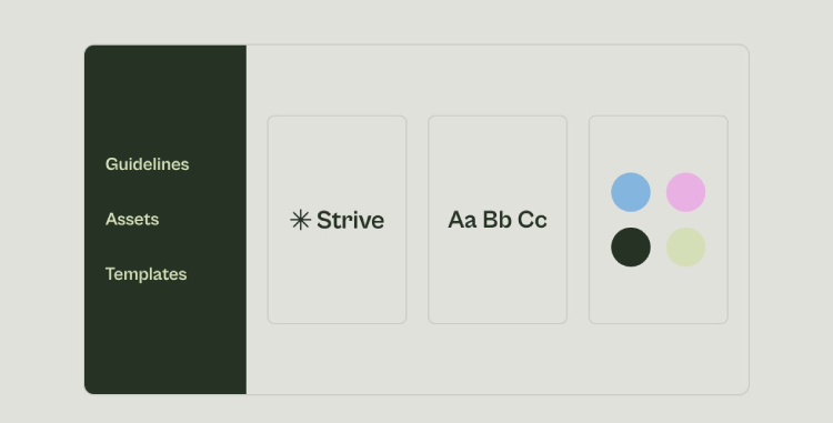
Visual identity isn’t just a logo. It’s the complete system of visual elements that make your brand recognisable and distinctive across every touchpoint customers encounter.
- Logo design: Serves as the visual anchor, the symbol customers associate with your brand. Great logos are simple enough to recognise instantly, distinctive enough to differentiate from competitors and versatile enough to work across contexts from mobile app icons to building signage.
- Colour palette: Creates immediate emotional associations and recognition. Colours aren’t arbitrary aesthetic choices. They’re strategic decisions that influence how customers perceive your brand’s personality, values and positioning. Red signals energy and excitement. Blue suggests trust and stability. Green connects to nature and health. The specific colours you choose and how consistently you use them determine whether customers can identify your brand at a glance.
- Typography: Communicates brand personality through font choices. Clean sans-serif fonts suggest modernity and efficiency. Elegant serif fonts convey tradition and sophistication. Bold display fonts project confidence and energy. Typography choices shape how customers perceive your brand’s tone even before reading the actual words.
- Imagery style: Establishes the visual language your brand speaks. Some brands use vibrant photography to celebrate real customer moments. Others employ minimalist illustrations with limited colour palettes. Still others create bold graphic patterns that transform into recognisable brand assets. Consistency in imagery style helps customers recognise your content instantly even before seeing your logo.
- Design principles: Govern how these elements combine across applications. Consistent spacing, layout grids, compositional approaches and visual hierarchies create cohesive brand experiences whether customers encounter you through packaging, websites, social media or physical stores.
Together, these elements form a visual identity system that works as an interconnected whole rather than isolated pieces. The goal isn’t just looking good. The goal is to create visual consistency that builds recognition, communicates brand values and differentiates you from competitors.
Why visual identity matters more now than ever
Several converging trends have elevated visual identity from nice-to-have to business-critical.
- Digital saturation: Means customers encounter hundreds of brands daily across social media, search results, emails and websites. Standing out requires instant visual recognition. Brands with strong visual identity cut through noise whilst faceless brands get ignored.
- Shortened attention spans: Force brands to communicate instantly. Research shows website visitors form opinions within 50 milliseconds based primarily on visual appeal. You don’t get time to explain your value proposition. Your visual identity must communicate quality, trustworthiness and relevance immediately.
- Platform proliferation: Multiplies touchpoints where customers encounter your brand. Your visual identity must work seamlessly across Instagram stories, LinkedIn posts, email signatures, packaging, store signage, app interfaces and dozens of other contexts. Inconsistency fragments brand perception whilst strong visual identity compounds recognition with every exposure.
- Visual-first platforms: Dominate how customers discover brands. Instagram, Pinterest, TikTok and YouTube prioritise visual content. Brands with compelling visual identity naturally perform better on these platforms, generating more engagement, shares and conversions than competitors with weak visual presence.
- Global competition: Means customers can choose alternatives from anywhere. Local monopolies no longer exist. Visual identity helps brands compete beyond just price and features by creating emotional connections and perceived differentiation that justifies premium positioning.
- Trust signals: Matter intensely in crowded markets. Professional visual identity signals that your business invests in quality, plans to exist long-term and cares about customer experience. Amateur or inconsistent visuals raise doubts about whether customers should trust you with their money.
These forces combine to make visual identity the first and often decisive factor in whether customers consider, remember and choose your brand. Getting this wrong doesn’t just cost you aesthetic appeal. It costs you customers, revenue and market position.
The cost of not having a strong visual identity
The absence of a strong visual identity creates measurable business consequences that compound over time.
- Invisibility in discovery: Means potential customers never notice you. When scrolling social feeds, scanning search results or browsing retail shelves, customers’ eyes literally skip over brands without a distinctive visual presence. You’re paying for advertising and shelf space that generates zero impact because nothing captures attention.
- Reduced memorability: Prevents brand recall. Even customers who interact with your business struggle to remember you afterwards because nothing distinctive anchors the experience. They know they bought “that thing from some brand” but couldn’t identify you in a lineup. This kills word-of-mouth recommendations and repeat purchases.
- Perceived lower quality: Costs you premium pricing power. Customers unconsciously associate visual presentation with product quality. Brands with amateur or inconsistent visual identity face price resistance because customers assume the product quality matches the presentation quality. You’re forced into price competition rather than value competition.
- Eroded trust: Increases customer acquisition costs. Professional buyers and sophisticated consumers use visual identity as a screening mechanism. Weak visual presence suggests operational instability, lack of resources or insufficient commitment to the business. Risk-averse customers simply choose more established-looking alternatives.
- Fragmented customer experience: Confuses customers when your brand looks different across touchpoints. Instagram uses one colour scheme, the website uses another and packaging uses a third. Customers question whether these are even the same brand, undermining the cumulative recognition you should build with repeated exposure.
- Competitive disadvantage: In the attention economy. Your competitors with strong visual identity capture disproportionate attention, engagement and market share not because their products are necessarily better but because their visual presence makes them more noticeable, memorable and trustworthy.
These costs aren’t one-time hits. They compound daily as customers make thousands of micro-decisions about which brands deserve attention, consideration and purchase. Over months and years, weak visual identity translates directly into lost revenue that significantly exceeds the investment required to fix it.
Brands that mastered visual identity
Examining brands with exceptional visual identity reveals what world-class execution looks like.
- Apple: Built its $516.6 billion brand value significantly through a minimalist visual identity. The bitten apple logo is instantly recognisable globally. Consistent use of white space, clean typography and product-focused photography creates a unified aesthetic across retail stores, product packaging, websites and advertising. Customers recognise Apple’s visual language before seeing the logo. This visual consistency reinforces brand values of simplicity, quality and innovation whilst commanding premium pricing that competitors cannot match.
- Nike: Demonstrates how simple visual elements create powerful recognition. The swoosh logo alone communicates motion and achievement. Bold typography exudes confidence. Consistent use of black and white with occasional vibrant colour pops makes Nike instantly identifiable, whether on billboards, social media or product packaging. The “Just Do It” tagline, combined with dynamic photography of athletes, creates a cohesive identity that resonates emotionally with customers while differentiating Nike from competitors.
- Coca-Cola: Proves that visual identity can remain effective for over a century. Their red and white colour scheme and Spencerian script logo have stayed remarkably consistent since 1892. The distinctive contour bottle shape is recognisable even without labels. This visual consistency creates nostalgia and tradition whilst allowing Coca-Cola to remain relevant across generations. Their visual identity evokes happiness and togetherness through warm imagery, joyful scenes and celebratory messaging that transcends cultural boundaries.
- McDonald’s: Golden arches achieve instant recognition globally. The red and yellow colour palette signals energy and appetite stimulation. Consistent visual identity across thousands of locations worldwide creates familiarity and reliability. Customers know exactly what to expect visually, regardless of whether they’re in Mumbai, Manhattan or Melbourne. This visual consistency reduces perceived risk and encourages trial in unfamiliar locations.
- Starbucks: Built a community-focused identity through a distinctive green and white colour palette, mermaid logo and warm store aesthetics. Their visual identity conveys calm, relaxation and connection to nature whilst aligning with sustainability messaging. Consistent typography, store design and product packaging create a cohesive experience that customers associate with comfort and quality.
These brands invested heavily in developing and maintaining visual identity systems that work consistently across all touchpoints. The payoff is measured in billions of dollars of brand value, customer loyalty that transcends rational product comparisons and pricing power that competitors cannot replicate through product features alone.
How to build a visual identity that lasts
Creating effective visual identity requires a systematic approach rather than ad hoc decisions.
- Start with brand strategy: Before touching design software. Visual identity must express brand positioning, values and personality. Attempting to design without a strategic foundation produces pretty pictures without a business purpose. Define who you serve, what makes you different and what you want customers to feel before making visual decisions.
- Research the competitive landscape: To identify visual opportunities. Document competitors’ colour palettes, logo styles and design approaches. Find the white space where you can look distinctive rather than derivative. Sometimes the best differentiator is going minimal in a cluttered category or using bold colours in a conservative industry.
- Develop comprehensive guidelines: Documenting all visual elements and usage rules. Strong visual identity requires documentation that internal teams and external partners can reference. Guidelines should specify exact colours (Pantone, CMYK, RGB, HEX), approved fonts with hierarchy rules, logo variations with minimum sizes and clear space requirements, photography style with examples and prohibited uses that protect brand integrity.
- Test across contexts: Before finalising decisions. How does your logo look on Instagram profile pictures? On mobile app icons? On large signage? In black and white? Printed on fabric? If visual elements don’t work in critical contexts, redesign before launching. Discovering limitations after implementation costs exponentially more than testing early.
- Implement consistently: From day one. Launch with a complete visual identity system applied across all touchpoints simultaneously. Partial implementation creates an inconsistency that undermines recognition. Better to delay launch until everything is ready than to launch with a fragmented identity.
- Maintain discipline: Over time. The temptation to “freshen up” visual elements or allow exceptions for specific campaigns undermines the consistency that builds recognition. Strong visual identity requires saying no to short-term creative impulses that sacrifice long-term brand value.
Working with a branding agency in Ahmedabad ensures professional execution and helps implement visual identity effectively across digital touchpoints where most customers encounter your brand first.
Conclusion
Visual identity has evolved from aesthetic consideration to business imperative. In attention-scarce environments where customers make split-second judgments, your visual presence determines whether you’re noticed, remembered and chosen. Brands that invest in strong, consistent visual identity build recognition, communicate values and differentiate themselves whilst commanding premium pricing. For these brands, working with a digital marketing agency in Ahmedabad ensures the professional execution of your visual identity to your target audience. Those that neglect visual identity face invisibility, price commoditisation and competitive disadvantage that compounds daily. The question isn’t whether visual identity matters. The question is whether your current visual identity effectively serves your business objectives or whether inconsistency and weak execution are costing you customers and revenue you’ll never recover.
FAQs

Vasim Samadji is a partner at Flora Fountain, where he leads the Business and Marketing Strategy divisions. In a world where everyone is used to sugarcoating, his directness is often considered rude. But that shouldn't be a problem if you like the no-nonsense approach. Because he is a seasoned professional...