

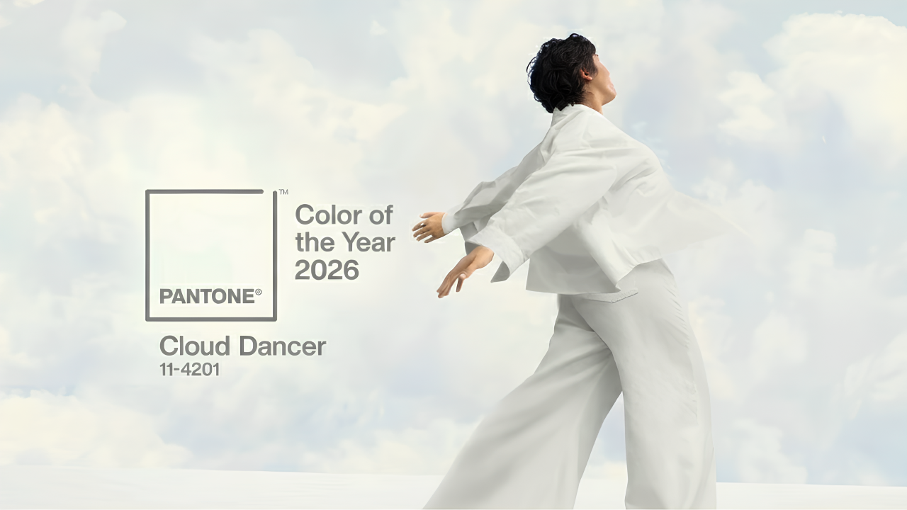
So Pantone has announced Cloud Dancer as the Colour of the Year 2026. PANTONE 11-4201, to be precise. A shade of white. Not off-white with some intriguing undertones. Not cream with a whisper of warmth. Just white. Clean, minimal, uncomplicated white. For the first time in the history of the Pantone Colour of the Year program, a white shade has taken the crown.
The internet has feelings about this (Shocking). Strong feelings. Some see it as a brilliant strategic choice representing fresh starts and mental clarity. Others see it as Pantone waving the “white” flag to surrender, quite literally. Both groups are loudly expressing their opinions across social media, design forums and industry publications.
But here’s the thing: whether you find Cloud Dancer inspiring or uninspiring, brands still need to understand what this choice means for design trends, consumer psychology, and marketing strategies in 2026. Because love it or not, Pantone’s annual colour declaration influences billions in consumer spending, shapes product development cycles and guides creative direction across industries.
So let’s discuss Cloud Dancer with clear eyes and practical focus. What it is, why Pantone chose it, how brands are already using it and whether your business should care.
Table of Contents:
- What exactly is Cloud Dancer
- Why Pantone chose white for 2026
- The psychology behind the choice
- How industries are responding to Cloud Dancer
- The controversy nobody’s pretending doesn’t exist
- Practical applications for brands
- Cloud Dancer versus previous years
- What this means for your business
- Conclusion
- Frequently Asked Questions
What exactly is Cloud Dancer
Cloud Dancer is PANTONE 11-4201, officially described as “a soft, airy white that embodies purity, serenity and new beginnings.” According to Pantone, it represents “a blank canvas offering the promise of renewal and the freedom to reimagine and recreate.”
In visual terms, Cloud Dancer sits on the cooler end of the white spectrum without leaning too far into stark brightness. It’s softer than pure white but cleaner than cream. Think fresh bedsheets, minimal Scandinavian interiors or the background of a well-designed website.
Pantone positions Cloud Dancer as more than a colour but as a concept. Their official statement emphasises themes of clarity, simplicity, transparency and openness. The name itself evokes lightness, movement and ethereal qualities rather than static blankness.
Whether you find this poetic or pretentious likely depends on your general tolerance for marketing language. But the practical reality remains: this is the colour major brands, retailers, and designers will reference throughout 2026.
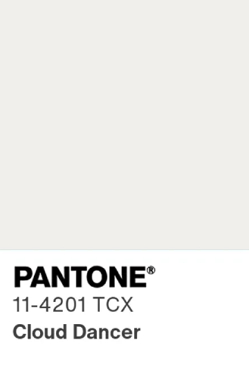
Image source: Pantone
Why Pantone chose white for 2026
Pantone doesn’t select colours randomly. Their process involves analysing global cultural trends, socio-economic shifts, consumer behaviour patterns and emerging aesthetics across industries. The Pantone Colour Institute examines everything from fashion runways to technology launches, political movements to wellness trends.
According to Pantone’s Vice President Laurie Pressman, Cloud Dancer emerged from observing a collective desire for mental clarity and simplified living. After years of complexity, division and information overload, their research suggested audiences are craving visual and emotional breathing room.
The timing aligns with several observable trends. Minimalism continues to dominate interior design. Quiet luxury persists in fashion. Digital detox movements grow stronger. Mental health awareness increases globally. Consumers increasingly value transparency from brands they support.
Cloud Dancer supposedly captures this zeitgeist. It’s the visual equivalent of decluttering your space, simplifying your schedule and focusing on what actually matters. It represents hitting reset after chaos.
Whether this analysis feels accurate or convenient, Pantone has decades of experience reading cultural moments. Their track record suggests they’re not just guessing. They’re synthesising enormous amounts of data into one symbolic choice.
The psychology behind the choice
White carries complex psychological associations. In Western contexts, it typically represents purity, cleanliness, simplicity, peace and new beginnings. In many Eastern cultures, white symbolises mourning and endings. Context matters significantly.
From a marketing psychology perspective, white creates interesting dynamics. It suggests premium quality and minimalism. Luxury brands frequently use white space liberally in their design. Apple’s aesthetic philosophy centres heavily on white. High-end fashion houses embrace white for its timeless elegance.
White also provides versatility. It works as a backdrop for literally any other colour. It doesn’t compete for attention. It amplifies whatever you pair with it. For brands, this makes white remarkably adaptable across different markets, seasons and contexts.
Looking at it from the perspective of a top-tier branding agency, the advice would be simple. Understanding these associations matters because they influence how audiences perceive brands adopting Cloud Dancer in their visual identity. The colour doesn’t just look clean; it signals specific values and priorities to consumers.
How industries are responding to Cloud Dancer
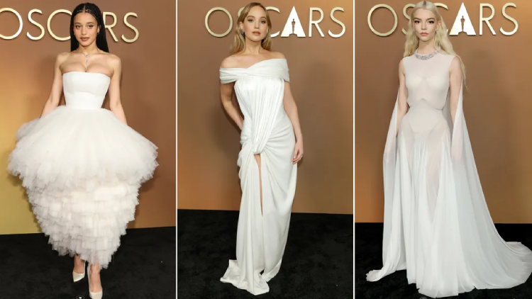
Image source: Pantone
Fashion was quickest to embrace Cloud Dancer, though that’s partially because minimalist white has been trending regardless. Spring/Summer 2026 collections feature white prominently. Designers are showcasing flowing white fabrics, monochromatic looks and clean silhouettes that align with Cloud Dancer’s aesthetic.
Luxury fashion particularly embraces the trend. White represents “quiet luxury,” the anti-logo, understated wealth aesthetic that’s dominated high-end fashion recently. Cloud Dancer gives this movement official validation and a marketing hook.
Interior design responds enthusiastically to Cloud Dancer because white never truly goes out of style in home décor. Expect to see paint companies releasing Cloud Dancer-inspired shades, furniture retailers highlighting white pieces and design magazines featuring light, airy spaces.
Technology brands already built on minimalist aesthetics likely won’t change much. Apple, Google and similar companies have been using white strategically for years. Cloud Dancer simply confirms their existing direction.
Beauty and cosmetics brands respond with white packaging, clean formulations and minimalist branding. Several major brands have already announced Cloud Dancer-inspired product lines for 2026.
The controversy nobody’s pretending doesn’t exist
Let’s address it directly: many people think choosing white as Colour of the Year is lazy. People think it is ‘uninspiring’ and are using insulting yet creative words like “ Pantonedeaf” (hilarious, tbh) on the socials. Social media responses range from bemused to genuinely annoyed. Design forums debate whether white qualifies as a colour at all. Critics argue Pantone played it safe rather than making a bold statement.
Some criticism carries political undertones. In a year marked by global tensions, social movements and complex cultural conversations, choosing white feels tone-deaf to some observers. The symbolism feels too convenient, too sanitised, too interested in appearing neutral rather than taking any stance.
Others view the choice more cynically. White is easy to manufacture, works with existing inventory and requires minimal adaptation from brands. Sceptics suggest Pantone chose what would cause the least disruption rather than what would inspire the most creativity.
Fashion critics note that white has dominated runways for multiple seasons already. Cloud Dancer isn’t predicting trends so much as confirming what’s already happening. This raises questions about whether Pantone leads culture or simply follows it whilst claiming leadership.
There’s also practical criticism. White is notoriously impractical. It stains easily, shows wear quickly and requires constant maintenance. For everyday products, white creates headaches for consumers. Critics wonder whether Pantone considered real-world usability.
Practical applications for brands
Regardless of personal opinions about Cloud Dancer, brands face practical decisions about whether and how to incorporate it.
For visual identity and branding: White works beautifully as negative space, creating breathing room in logos, websites and marketing materials. It amplifies other brand colours rather than competing with them.
For product design: White communicates cleanliness, quality and sophistication across categories. From electronics to homeware to beauty products, white packaging signals premium positioning. However, consider practical maintenance issues and whether your audience values aesthetics over functionality.
For interior spaces: Retail environments, offices and hospitality spaces can embrace Cloud Dancer for calming, open atmospheres. White walls, furnishings and fixtures create versatile backdrops for seasonal décor changes and brand activations.
For digital presence: White space in web design improves readability, focus and user experience. Cloud Dancer validates design approaches prioritising simplicity over maximalist layouts.
For fashion and textiles: White clothing and accessories work year-round. Cloud Dancer provides marketing language for promoting white products beyond traditional seasonal associations. Frame white as timeless investment pieces rather than trendy items.
For content and campaigns: Use Cloud Dancer as a campaign hook for themes like fresh starts, clarity, transparency or simplification. The colour provides ready-made storytelling angles that resonate with current consumer mindsets.
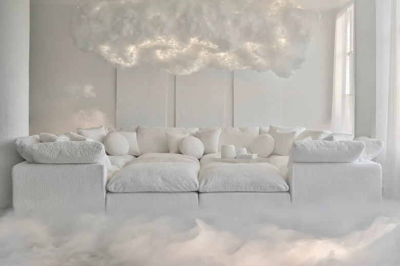
Image source: Pantone
Cloud Dancer versus previous years
Context helps. Let’s compare Cloud Dancer with recent Pantone selections.
2025: Mocha Mousse (PANTONE 17-1230): A warm, earthy brown representing comfort, stability and natural connection. Very different energy from Cloud Dancer. Mocha Mousse felt cosy and grounding. Cloud Dancer feels open and aspirational.
2024: Peach Fuzz (PANTONE 13-1023): A soft, nurturing coral representing kindness, connection and compassion. Emotionally warm. Cloud Dancer strips away this emotional directness in favour of neutral openness.
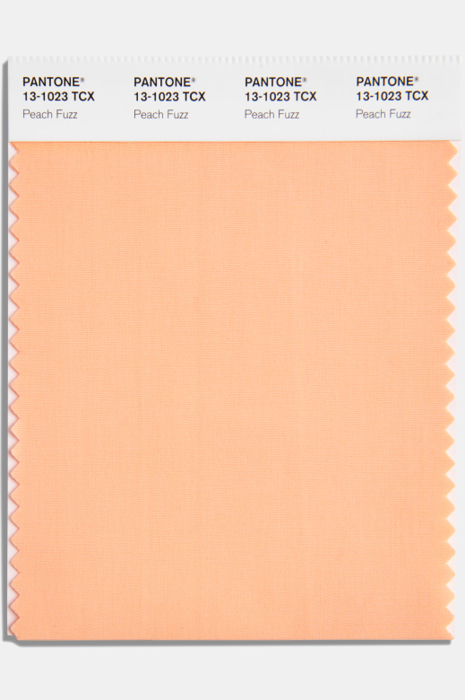
Image source: Pantone
2023: Viva Magenta (PANTONE 18-1750): A bold, vibrant red suggesting energy, rebellion and fearless creativity. Dramatically different from Cloud Dancer. Viva Magenta demanded attention; Cloud Dancer quietly invites contemplation.
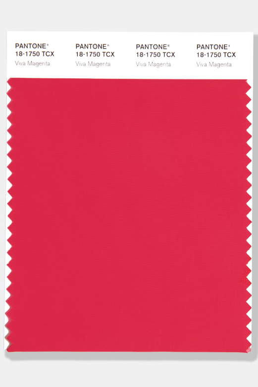
Image source: Pantone
The shift from vibrant, warm, emotionally charged colours to cool, minimal white represents a significant directional change. Previous selections made bold statements. Cloud Dancer makes an ‘anti-statement’ statement.
This pattern suggests Pantone is reading a cultural moment of exhaustion with intensity. After years of dramatic colours reflecting dramatic times, perhaps audiences genuinely want visual simplicity and emotional breathing room (Again, this is what they think).
What this means for your business
Should your brand care about Cloud Dancer? Depends on several factors.
Consider your industry: Fashion, interior design, beauty and lifestyle brands benefit most from aligning with Pantone trends because their audiences actively follow colour forecasting. Technology, finance and B2B sectors face less pressure to respond immediately.
Evaluate your brand positioning: If your brand emphasises innovation, luxury, wellness or simplicity, Cloud Dancer aligns naturally. If your brand personality centres on boldness, warmth or tradition, forcing white into your identity might feel inauthentic.
Think about practical implementation: Adopting Cloud Dancer doesn’t require a complete rebrand. Strategic touches, seasonal campaigns or product line extensions can reference the trend without overhauling everything.
Consider your audience’s expectations: Some audiences expect brands to engage with cultural trends actively. Others prefer consistency regardless of external influences. Know which group you’re serving.
Balance trend participation with brand authenticity: Following trends signals cultural awareness. Ignoring your established identity for trends signals desperation. Find the intersection where Cloud Dancer genuinely serves your brand strategy rather than just ticking a trend box.
Working with a branding agency helps navigate these decisions strategically. The right agency assesses whether trend participation serves your long-term brand goals or creates a temporary distraction from more important work.
Conclusion
Cloud Dancer, simply put, is white. Specifically, it’s a soft, airy white that Pantone believes captures the zeitgeist of 2026. Some find this choice inspired and meaningful. Others find it safe and unremarkable. Both perspectives have validity.
For brands, the relevant question isn’t whether Cloud Dancer is brilliant or boring. The relevant question is whether engaging with this trend serves your business objectives, resonates with your audience and aligns with your brand identity. Sometimes the answer is yes. Sometimes it’s no. Both answers are fine. Still unsure if this white goes with your red, blue or black? Don’t panic. As an experienced digital marketing agency, it is our job to seamlessly integrate emerging design trends into your brand language without diluting who you are. Cloud Dancer is just a colour. What matters is how it’s used.
What matters is making informed decisions about how colour trends fit into broader brand strategy rather than reflexively following or rejecting them. Cloud Dancer provides opportunities for brands emphasising clarity, simplicity and renewal. It’s less relevant for brands built on warmth, energy or complexity. Know the difference and act accordingly.
Frequently Asked Questions

The founder and partner of Flora Fountain, Shefali leads the Content and Technology divisions. A one-time engineer who started her career writing front-end code, she took a detour sometime during her 9 years in New York, studied journalism and started writing prose, poetry and sometimes jokes. She now has 15...