You’re burning through your advertising budget faster than a bonfire burns newspaper. Your ads get impressions. They get clicks. Then they get nothing. No conversions. No leads. Just a depressing parade of bounced visitors and wasted rupees.
Before you blame the algorithm, the audience or Mercury being in retrograde, consider this: your branding might be sabotaging your advertising before campaigns even get a chance to work.
Great advertising with weak branding is like hiring a world-class salesperson and making them sell a product with no name, unclear benefits and packaging that looks like it came from a discount bin. Doesn’t matter how persuasive the salesperson is. You would have to take in the help of the best branding agency in Ahmedabad to save your business.
Most businesses obsess over ad creative, targeting and bidding strategies whilst ignoring the foundation that determines whether any of it works: brand clarity, consistency and credibility. Fix your branding mistakes, and suddenly your advertising ROI transforms without spending an extra rupee on media.
Let’s identify the branding mistakes killing your advertising performance and, more importantly, how to fix them.
Table of Contents:
- Mistake #1: Your Brand Has an Identity Crisis (And Everyone Can Tell)
- Mistake #2: Your Value Proposition Is Vague Corporate Nonsense
- Mistake #3: Visual Chaos That Makes Designers Cry
- Mistake #4: You’re Trying to Be Everything to Everyone
- Mistake #5: Your Brand Voice Sounds Like a Robot Wrote It
- Mistake #6: Treating Branding as a One-Time Project
- Concluding Thoughts
- Frequently Asked Questions
Mistake #1: Your Brand Has an Identity Crisis (And Everyone Can Tell)
The Problem:
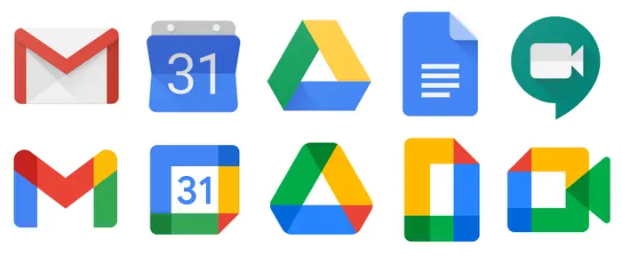
Your logo is one thing on your website, slightly different on social media and completely different in your ads. Your brand name appears as “ABC Solutions,” “ABC Digital” and “ABC Marketing” across various platforms. Your messaging shifts from professional to casual to desperately trying too hard, depending on which team member created the content.

The most used Google apps and their Logos
This isn’t “being flexible.” It’s confusing customers and destroying trust. When prospects see inconsistent branding, their brain registers “amateur” or worse, “potentially fraudulent.” Neither is great for conversion rates.
The Fix:
-
Audit Everything:
Pull up every customer touchpoint: website, social media profiles, business cards, email signatures, ads, and any physical materials. Screenshot everything. Lay them side by side. The inconsistencies will smack you in the face. -
Standardise Immediately:
Choose one logo. One brand name spelling. One colour palette. Document these decisions and enforce them ruthlessly across all platforms. Update everything within a week. Yes, a week. This isn’t optional. -
Version Control Your Assets:
Create a shared folder (Google Drive, Dropbox, whatever) containing only current, approved brand assets. Any outdated versions get deleted or moved to an “archive” folder. When anyone needs a logo, they use what’s in the current folder. No exceptions. -
The Result:
Advertising campaigns that look professionally executed rather than cobbled together by five different freelancers who never communicated.
Mistake #2: Your Value Proposition Is Vague Corporate Nonsense
The Problem:
“We provide innovative solutions leveraging cutting-edge technology to deliver world-class results for our valued clients.”
Congratulations, you just described every business ever. Or no business. Hard to tell. Vague value propositions don’t just fail to persuade. They actively repel by signalling you don’t actually know what you offer.
When your advertising features this corporate word salad, prospects scroll past immediately because they’ve learned that vague messaging means boring, commoditised offerings.
The Fix:
- The Clarity Test: Can a 12-year-old understand what you do and why someone would choose you over competitors after reading one sentence? Is your branding statement something vague like, “We help businesses grow with smart solutions”… or something specific like, “We’re an advertising agency in Ahmedabad that helps retail brands increase qualified leads by 40% in 90 days”? If not, start over.
- The Specific Benefits Framework: Replace vague claims with specific, verifiable benefits. Instead of “innovative solutions,” say “reduce inventory costs by 23% in 90 days.” Instead of “world-class results,” say “our clients average 40% more qualified leads within their first quarter.”
- The Enemy Exercise: Identify your specific competitor and articulate precisely why a customer should choose you over them. “Unlike [competitor], we [specific differentiator], which means [specific customer benefit].”
- Test With Real Humans: Show your new value proposition to someone outside your company (ideally someone in your target audience). Ask them to explain back to you what you do and why you’re different. If they can’t, you’re still too vague.
- The Result: Advertising that immediately communicates value, attracting qualified prospects while repelling poor fits faster.
Mistake #3: Visual Chaos That Makes Designers Cry
The Problem:
Your ads use five different fonts, seven colours that don’t go together and images that look like they came from three different decades. Your logo appears in different sizes and positions on every piece of content. Some ads have professional photography, whilst others feature pixelated stock photos that everyone’s seen a thousand times.
Visual chaos doesn’t just look unprofessional. It makes your advertising work harder to get attention because prospects’ brains spend extra milliseconds processing the mess rather than absorbing your message.
The Fix:
- Choose a Primary and Secondary Font. That’s It: Your headings use one font. Your body copy uses another (or the same). Everything else is forbidden. If you’re tempted to use a third font for variety, resist. Variety comes from layout and content, not font chaos.
- Establish a Colour Palette (3–5 Colours Maximum): Choose 3–5 colours total. Use them consistently across all materials. Pro tip: one should be a neutral (white, black, grey) for backgrounds and text. The others should complement each other.
- Hire a Photographer Once, Use Photos Forever: Stock photos are fine for placeholders, but they all look like stock photos. One professional photo shoot gives you dozens of brand-specific images that immediately elevate your visual identity.
- Create Ad Templates: Design 3–5 ad templates that follow your brand guidelines. Use these for all campaigns. Swap out headlines, images and copy, but maintain the visual structure. This ensures consistency whilst allowing flexibility.
- The Result: Advertising that looks polished and professional, close to what a full-stack digital marketing agency in Ahmedabad could offer—earning trust before prospects even read your copy.
Mistake #4: You’re Trying to Be Everything to Everyone
The Problem:
Your advertising tries to appeal to startups and enterprises, B2B and B2C, technical buyers and casual consumers. You mention every service you’ve ever offered rather than focusing on what you do best. Your messaging contains phrases like “whether you need X or Y or Z, we’ve got you covered!”
This shotgun approach feels safe (nobody is excluded!), but it’s disastrous for effectiveness. When you speak to everyone, you resonate with no one. Your ads become wallpaper that prospects scroll past without processing.
The Fix:
- Choose Your Primary Audience: You can’t afford to target everyone in your advertising. Choose the audience segment that’s most profitable, easiest to serve or strategically most valuable, and build ads specifically for them.
- Create Separate Campaigns for Separate Audiences: If you truly serve multiple distinct audiences, create separate campaigns with separate landing pages for each. Don’t try cramming everyone into one generic message.
- Lead With One Thing: If you offer 15 services, pick the one that’s your greatest strength or highest margin. Build your advertising around that. Once you’ve established authority in one area, expand.
- The “So What” Test: For every sentence in your ads, imagine the prospect asking “so what?” If you can’t answer with a specific benefit relevant to your target audience, delete it.
- The Result: Advertising that speaks directly to a specific audience’s needs, dramatically improving relevance scores and conversion rates.
Mistake #5: Your Brand Voice Sounds Like a Robot Wrote It
The Problem:
Your advertising copy is technically grammatically correct but completely soulless. It reads like it was written by committee, run through legal review and stripped of any personality to avoid offending anyone. The result is forgettable content that prospects forget before they’ve finished reading it.
A bland brand voice is particularly disastrous in advertising, where you have milliseconds to create an impression. If you sound like every other business, prospects group you with every other business (meaning you’re competing purely on price).
The Fix:
- Define Your Brand Personality: Choose 3–5 adjectives describing how you want to sound. Professional? Approachable? Bold? Witty? Technical? Irreverent? Write these down and share them with everyone creating content.
- Study Brands You Admire: Find 3 brands with a voice you admire (ideally in different industries to avoid copying competitors). Screenshot their social posts, ads and website copy. Analyse what makes their voice distinctive—look for patterns in sentence structure, word choices and tone.
- Create a “We Sound Like / We Don’t Sound Like” List: Be specific. “We sound like a knowledgeable friend explaining something interesting over coffee. We don’t sound like a corporate press release or a desperate salesperson.”
- The Formula Test: Read your ads aloud. If you wouldn’t say it in a conversation, rewrite it. The best advertising sounds like a smart person talking, not a corporation broadcasting.
- The Result: Advertising that stands out through personality, making your brand memorable rather than interchangeable.
Mistake #6: Treating Branding as a One-Time Project
The Problem:
You hired a branding agency in 2018 for a one-time contract-based project. They delivered a logo, colours and some guidelines. You’ve been using these unchanged ever since, ignoring that your business, market and audience have all evolved. Your branding feels dated because it is.
Or worse, you’ve tweaked your branding randomly whenever someone had an opinion: a new colour here, a font change there, a logo “refresh” that nobody needed. The result is slow erosion of whatever brand equity you’d built.
The Fix:
- Annual Brand Health Check: Once yearly, audit how your brand is performing: Do customers describe our brand the way we want to be described? Has our visual identity started feeling dated? Has our target audience or positioning shifted? Are competitors out-branding us?
- Evolution, Not Revolution: Strong brands evolve gradually rather than reinventing themselves completely. Update incrementally: refresh photography style without changing the logo, modernise typography slightly, update messaging to reflect new services whilst maintaining core positioning.
- Document Changes: When you update any brand element, document why you changed it and update your guidelines. This prevents the “why do we do it this way?” confusion that leads to random changes.
- Strategic Refresh Timing: Major rebrands should happen only when you’re targeting a fundamentally different audience, your business model has changed significantly, your existing brand carries negative associations, or you’ve outgrown your original positioning entirely. Otherwise, incremental updates maintain equity whilst staying current.
- The Result: A brand that stays relevant without losing the recognition and trust you’ve built.
Concluding Thoughts
Weak branding doesn’t just look unprofessional; it quietly ruins advertising performance. It confuses prospects, erodes trust and forces every campaign to work harder for smaller results. The brands with the best ROI aren’t the ones spending the most, they’re the ones with clear identity, consistent visuals and sharp value propositions. Strong branding alone can lift ad performance by 40–60% without increasing spend.
Fix the biggest gaps first. If your branding feels different on every platform, align it now. If your value proposition sounds like vague corporate filler, rewrite it. If your visuals are chaotic, get clean templates made.


