

Every few years, the world of design gets swept by a movement. At one time, it was maximalism, intricate, expressive, overflowing with colour and detail. Today, it’s minimalism. From fashion to furniture to logos, less is more.
But when it comes to branding, should it always be that way? Does the minimalist logo, a trend championed by tech giants and high-end labels, work for everyone? Or is it just another visual fad that’s been applied a little too broadly?
Before deciding what your logo should look like, it’s worth exploring what minimalist design truly represents and whether it’s the right approach for your unique brand identity. And if you’re considering rebranding or starting fresh, consulting a professional branding agency can provide crucial insight into what will resonate with your audience.
Table of contents
- The Rise of Minimalism in Branding
- Why Minimalist Logos Became So Popular
- When Minimalism Works
- When It Doesn’t
- The Psychology Behind Simplicity
- Finding the Right Fit for Your Brand
- Real life examples of minimalists
- Final Thoughts
- FAQs
The Rise of Minimalism in Branding
Minimalism in logos didn’t begin yesterday. It has roots in the early modernist movements of the 20th century, think Bauhaus, Swiss design and the clear geometric forms that followed. But it’s explosion in recent years is directly linked to the digital revolution. Logos needed to shrink, fit app icons and adapt across devices of all sizes. Suddenly, ornate crests and busy visuals were liabilities. Clean, adaptable and versatile, minimalist logos became the obvious choices.
You might’ve noticed your favourite brands slowly evolving, losing details, moving to sans-serif fonts and simplifying colour palettes. This isn’t laziness. It’s a strategy.
And it’s part of broader shifts in how brands position themselves; less about shouting for attention, more about quietly conveying trust, clarity and sophistication.
Why Minimalist Logos Became So Popular
Minimalist logos offer more than aesthetic appeal. They serve key functional benefits:
Scalability: weather on a smartphone app or a billboard, minimalist logos retain clarity.
Timelessness: trends come and go, but simplicity endures.
Memorability: a clean, iconic mark sticks in people’s minds better than complex design.
International Appeal: Minimalist visuals transcend cultural boundaries more easily than nuanced illustrations.
It’s no wonder companies from tech startups to luxury brands are simplifying. The results? Logos that feel fresh, modern and globally accessible.
Experienced branding agencies understand this shift deeply, crafting identities that are not only visually appealing but also flexible enough to perform across diverse markets and platforms.
When Minimalism Works
Minimalist logos thrive under the right conditions. Here are some scenarios where simplicity speaks volumes:
Well- established brands: When a brand already has recognition, a minimalist design can distill its identity without losing meaning. Think of Mastercard or Pepsi, whose logos have evolved over time into simpler forms.
Tech and digital services: In digital contexts, clean logos read better on screens and at small sizes, crucial for apps, websites and social media.
Luxury and fashion brands: Simplicity often implies elegance. High-end labels like Yves Saint Laurent or Balenciaga have leaned into minimalism to project confidence.
Purpose-Driven Brands: When your brand is built on clarity, trust or innovation, minimalism reinforces the message without distraction.
Collaborating with an experienced branding agency in Ahmedabad can make a lot more difference. As such teams help you translate your values into logos that do more than just look good, it works hard for your brand.
When It Doesn’t
Despite its strength, minimalism isn’t always the best approach. In some cases it can strip the logo of a character or cause confusion. Here’s where it falls short:
New or unknown brands: starting from scratch? A hyper-minimal logo might lack the distinctiveness to make an impression. Without the weight of recognition, your logo needs more personality and not less.
Cultural or traditional brands: if your brand draws from heritage, community or storytelling, reducing your visual identity to abstract shapes may erase what makes you unique.
Saturated Markets: Many minimalist logos use similar elements, monograms, circles, basic shapes. In crowded industries, it’s easy to end up looking like everyone else.
Minimalism isn’t automatically meaningful. It needs context and concept. Otherwise, you’re left with a pretty shape that says very little.
The Psychology Behind Simplicity
Minimalist design taps into some deep psychological patterns. Humans naturally respond to order and clarity. A well-designed minimalist logo can:
Evoke Trust: Clean design suggests transparency and control.
Reduce Cognitive Load: Simpler visuals are easier to process and recall.
Convey Professionalism: No clutter, no chaos, just a confident, focused brand.
However, the line between simple and soulless is thin. A logo needs to feel intentional, not like a placeholder or afterthought.
That’s why smart businesses don’t jump on trends. They work with a strategic branding agency to define what simplicity means for them and how to make it resonate.
Finding the Right Fit for Your Brand
So, how do you know if a minimalist logo is right for you?
What’s the answer? Do minimalist logos always work?While they may not always be the first choice, but when they do, they can work brilliantly. The trick lies in knowing your brand, audience and goals. Simplicity is powerful only when it carries meaning.
Start with these questions:
- What’s the emotional tone of your brand: serious, playful, traditional or disruptive?
- Do you have existing brand equity that supports visual reduction?
- What do your competitors look like? How will your logo stand out?
- Is your brand digital-first or rooted in physical presence and locality?
There’s no shame in complexity if it’s done with purpose. Likewise, minimalism is powerful only when it’s meaningful.
The role of capable branding is to help you navigate these decisions, balancing visual style with strategic clarity.
Real-Life Examples Of Minimalist Logo
1. Apple
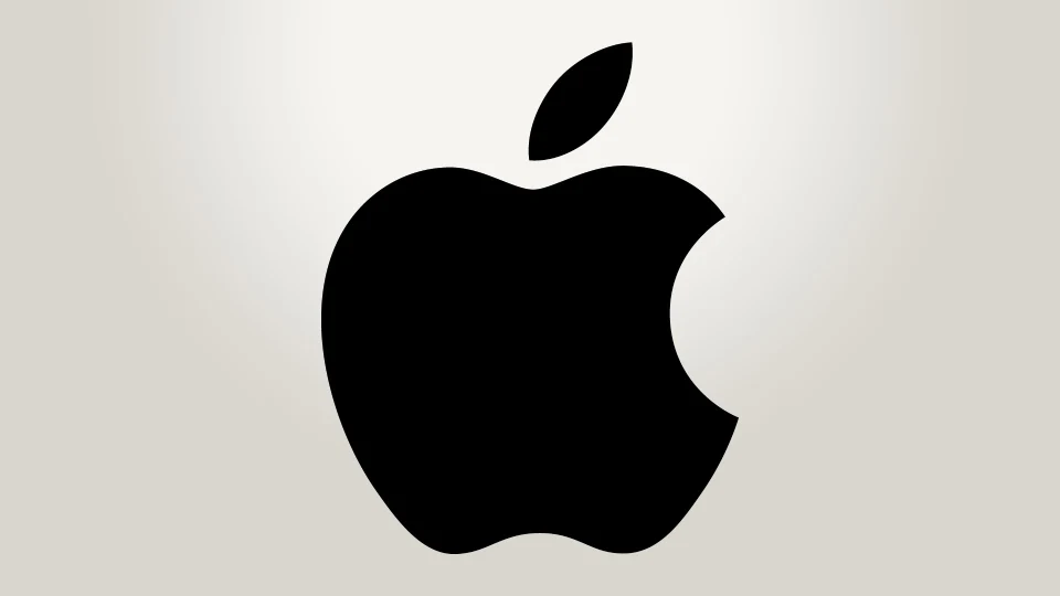
Apple’s logo is arguably one of the most iconic minimalist designs in the world. The simple bitten apple silhouette, often rendered in a single colour, speaks volumes without saying a word. It conveys innovation, clarity and premium quality, perfectly aligned with Apple’s brand values.
2. Nike
![]()
The famous Nike Swoosh is a textbook example of minimalist design. It’s sleek, dynamic and memorable, instantly associated with motion and performance. Despite its simplicity, the logo holds immense power because of its consistent and strategic use.
3. Google
![]()
Google’s logo has evolved over time, becoming cleaner and more minimal with each iteration. Its current wordmark features a simple sans-serif typeface and a straightforward use of primary colours. The design is friendly, modern and highly adaptable across digital platforms.
Brands Whose Minimalist Logos Succeeded and Those That Didn’t
While many brands have thrived by embracing minimalist logos, others have faced backlash or confusion after simplifying their visual identity. Here are real-world examples:
Brands with Successful Minimalist Logos
| Brand | Why It Worked |
|---|---|
| Apple | Simple, iconic, instantly recognizable; perfectly aligns with innovation and premium brand values. |
| Nike | Timeless, dynamic, and memorable; the Swoosh conveys motion and victory with a single shape. |
| Clean, modern, and highly adaptable across digital platforms. | |
| Coca-Cola | Classic script logo, strong brand heritage, highly recognizable worldwide. |
| McDonald’s | The golden arches are simple, memorable, and globally recognized. |
Brands Whose Minimalist Logos Missed the Mark
| Brand | What Went Wrong |
|---|---|
| Gap (2010 redesign) | The new logo was widely criticized for being generic and lacking character; backlash led to a quick return to the original. |
| Airbnb (2014 redesign) | The abstract new logo received mixed reactions; some found it too ambiguous and lacking clear brand connection. |
| Pepsi (some redesigns) | Certain redesigns were controversial and not well received, with some critics calling them forgettable or confusing. |
| London 2012 Olympics | The logo was polarizing and criticized for being confusing and unattractive, failing to resonate with the public. |
Final Thoughts
Minimalism is a tool, not a rule. While it’s easy to be drawn to what’s trendy, a logo should do more than just look good; it should carry meaning and support your brand’s deeper purpose.
Before choosing to simplify or elaborate, ask yourself: What story is your brand trying to tell? And will a minimalist approach amplify that message or mute it?
The key is to collaborate with a branding agency that prioritises strategy over style, one that takes the time to understand your brand before putting pen to paper.
FAQs

Vasim Samadji is a partner at Flora Fountain, where he leads the Business and Marketing Strategy divisions. In a world where everyone is used to sugarcoating, his directness is often considered rude. But that shouldn't be a problem if you like the no-nonsense approach. Because he is a seasoned professional...